- Walking Tour
- Season 1
- Episode 1
Architect Reveals Hidden Details of Washington, D.C.
Check out Nicholas Potts here:
Website: https://nicholasgpotts.com/
Instagram: https://www.instagram.com/nicholasgpotts/
Released on 04/07/2022
Today, we're in Washington, DC.
My name's Nick Potts.
I'm an architect
and we are gonna be doing an Architectural Walking Tour
of The National Mall.
[upbeat music]
The extent of the mall right now
from the Capitol to Lincoln Memorial,
that's exactly the same distance
from 14th Street to Central Park in New York.
So it's just an immense space and you can feel it,
you're walking blocks to move from building to building.
And a lot of this is due to the McMillan Plan
and it's embrace of these mega buildings.
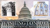
Right now, we're in front of probably
the most iconic building in Washington, DC,
The National Capital on the mall.
The Capitol building is really probably the most reworked
and remade building on The National Mall
and I would say it looks absolutely nothing
like the way it was originally envisioned.
You know, it's a Neo Georgian,
it's similar to the White House.
You can see the two parts
of the building that don't have columns.
That was really the original Capitol.
Everything else was a later edition as the nation grew
and we discovered that we needed
more space for our legislature.
As the building grew after the Civil War,
things really started magnifying immensely.
So the wings on the left and the right were introduced
which created new house and Senate chambers,
essentially developing the old Capitol
in a much larger building.
At that point, the dome just looked ridiculous.
It was too small and the proportions were totally off.
And so this new dome was built on top of it
totally changed the composition.
What I find really thing about the dome on the US Capitol
as opposed to most of the other state house domes
and the domes it was based on in Renaissance Rome
is that those were all built of stone.
This, because it was on an existing foundation,
because it was introducing and working with new technology,
it's all cast iron.
It looks like it's always been here.
It looks like it's kind of not innovative.
It actually is quite innovative
and doing something new with an old form.
If you look at the capitals
and the columns they're not truly Corinthian,
there's fun things like corncobs and things.
So it's trying to Americanize a non-American style.
[upbeat music]
We're here on Pennsylvania Avenue
in front of one of the most famous buildings in the world,
the White House.
What's interesting about the White House
is, like a lot of buildings in Washington, DC,
it's really a long history of being made
and remade over and over again,
to suit a growing nation
and to suit a different and evolving styles.
So it was originally built by enslaved laborers
and designed by an Irish architect.
Not intended to be a palace,
it was meant to be an every man's
sort of aspirational house.
The entire mall was originally intended
to be not surrounded by museums,
but to be surrounded by mansions with gardens.
It was actually designed originally without the porticos
and it was a much simpler kind of Irish country house
with minimal detail and it sandstone.
The white didn't come until much later.
The porticos were added to make it
seem a bit more monumental
but you can see traces of the original building behind it,
you can see the flat pilasters.
In a house like the White House,
where the the walls are load bearing masonry
the pilasters are purely decorative.
The only flourish about the building
are the pediments over the ground floor windows
which alternate between a triangular
and a rounded pediments.
So it's using detail to embellish
what's otherwise a very simple building
and then it grew and became something totally different.
So the White House kind of has a dual personality.
There's the north facade that we're looking at right now
and the south facade facing towards the mall.
In a proper Georgian house at of the time,
sometimes you would see portico facing
either to the north or to the south,
but not to both sides.
These porticos were added
about 20 years after the building was built.
The one to the north that we're looking at now
was more of a porte-cochere where carriages
would drop someone off.
At the time, so this is really
the urban side of the White House.
And then the South Portico,
the rounded one with the Truman Balcony
which was actually added
after the 1950s reconstruction of the building.
The portico itself was there
but that was meant more to overlook the mall
in the pastoral yard that was envisioned
for that face of the house.
In the 1950s, during the Truman era,
the house was really falling apart.
It was way too small.
It had been renovated haphazardly over the years.
It was essentially not structurally sound.
So everything that wasn't the exterior walls was demolished
and a new steel building was built in place.
So it's a totally like essentially a modern building
enclosed by the remnants of what it had been.
[upbeat music]
We're standing across the street from Lafayette Park
and directly across the street from the White House,
looking at a row of federal townhouses.
A glimpse of what Washington DC could have been.
When the White House was going up in like 1790s
up to around 1800, this was also being developed.
If you look at old maps of this area,
there was a significant amount of townhouse development.
In the 20th century,
the vision for Washington shifted
from being something much smaller
and more a little less planned into kind of
the totalizing neoclassical building plan model
that we see today.
[upbeat music]
Right now, we're standing in front
of the old Executive Office Building
directly next door to the White House.
By this point, we're in the 19th century
and the country and architecture is starting to struggle
with the whole idea of bigness
and how you deal with very large multipurpose buildings.
And it's really a love letter
to the Louvre in the French second empire style.
So even though the composition of the building is totally,
totally innovative and new,
it's using a lot of very familiar elements
that we've seen in previous styles of architecture
but it's going a bit to the extreme with them.
There are multiple columns that are paired
that really aren't doing anything
beyond breaking the building down into a more cohesive
and more legible parts.
Whenever you see a mansard roof,
you immediately start thinking about France.
Benjamin Franklin was a huge proponent of France.
Franklin was a major celebrity in France
and there was just a lot of love
between these two nations undergoing revolutions
under a similar period of time.
So there's definitely some political alignments
they're gonna show up
in our architecture that we started looking at.
Architecture has always been this back and forth
between lightness and solidity.
And here we're in a moment of really sculptural solidity
and trends will obviously swing back and forth,
you know think about this building being reviled
and then loved and will probably be in a moment
sometime soon where people want that sort
of thickness and shadow and relief again.
[upbeat music]
Right now, we're standing in front of the Renwick Gallery
on Pennsylvania avenue and 17th street.
So the Renwick Gallery is really peak
fascination with France.
This building is essentially a miniaturized version
of the entire move originally designed and as an art gallery
for the Corcoran collection, the Corcoran Gallery of Art
there were relatively few precedents
in museum design at the time,
aside from the Louvre this Corcoran collection,
which is a Renaissance detail
that essentially looks like a worm has eaten away
at a material.
Interestingly, the material on this
is not the stone that the Louvre built out of
but this is actually brick been speculated.
This was actually inspired by a visit to another site
in Paris, the Place des Vosges, which is a similar sort
of Neo Renaissance aesthetic, but it's in brick.
So the form of the Louvre squished
into a very small compact box and then given a new material
but because nor went down, the runway is carved off stone.
It has to pop a lot more.
And these sorts of Roundels
which are the round pieces in gelatin
our Neo-Renaissance are motifs that fascinated
the architects as they were doing essentially
their grand tour in Paris.
As this changed the museum
started becoming a little bit more like a temple
which is what we see a lot of around the mall.
These kind of Neo classical Greco, Roman temples
and the Louvre was built as a palace
which was the place where a lot of these collections
were originally housed.
Palace style architecture for a museum
was a fairly short lived, but not crucial pivot
in the emergence of museums as a building time.
[upbeat music]
6 now we're in front of the castle
at the Smithsonian Institution.
What's really interesting about the castle
is that it shows an example
of what the mall was like before the McMillan plan.
The castle style is really reflective
of the predominant tastes of when it was built
in the mid 19th century around 1847
when there's a big interest
in the picturesque and looking more towards the countryside
than towards the city.
Technically it's a Rundbogenstil,
which is a rounded almost Germanic Luscian
of an English pioneer style.
So it's kind of picking
and choosing from European influences.
But the notable thing about it is it's informality
it's asymmetrical hall, and it's fairly rough hew
And the asymmetrical tower is really the thing that sticks
out the most is this not being a formal classical building.
You can see these carnations and these ramp parts
these things that you, the Norman arrow
when people were building castles
they were so you could put a cannon or guns in front of it.
Now it's purely decorative and communicating
a lineage back towards history
rather than it's than it's true function.
The door portal does similar things.
There are some Renaissance motifs going on
with kind of these twisting shapes and the group columns,
and the fact that telescopes and re sasin
in James Renwick who designed this
had designed several churches
including Grace Church in New York.
So there's definitely an ecclesia church language
also going on here.
Currently, we think of there being a very peer separation
between academia and religion.
But if you go back to English schools
like Oxford, like Cambridge, you could see this building
on the Yale campus, which did a lot
of these collegiate Gothic things.
I mean, there's definitely a presence of ecclesiastic
and spiritual architecture, even if the institution is not.
Because if you think about the middle ages,
the research and the universities were coming
from Monasteries and religious orders.
[upbeat music]
Right now, we are in front
of the Arts and Industries Building
at the Smithsonian Institution.
So this was 1881, 30 to 40 years after the castle
a bit more modern, a bit less referential to history
really kind of prime example of an exhibition
style building, which is essentially a building type
that emerged out of world's fairs and exhibits
that were venues for people to trade
and exchange cultural ideas.
The arts and industry's building
is a highly decorated polychrome building.
You imagine a warehouse being very kind of generic space.
That's meant to look like anything is exhibits, come and go.
In this example, and actually in a lot
of these building types, the exterior of the building
be comes a means of communication.
And this is high Victorian style.
It's using brick and lots of different colors of brick.
There are influences of arts and crafts.
It's a bit of an eclectic style that is all about exuberance
and whimsy and vibrancy and arts and crafts movement
came out of a reaction against law,
formal on class izing movement that preceded.
And it was the rise of machinery
and ornament being made in factories.
So it's a return to the workshop
and to the makers versus the machines
and a building like this because it's handcrafted,
you know you can picture the masons, building up the stones
and creating these patterns.
It's referencing some of that.
The blue brick up at the top of the towers
think about different sorts of kilns.
If they need to fire that it's almost referencing pottery
and ceramics work.
[upbeat music]
Right now, we're standing outside of the west building
of the national gallery of art, Andrew Mellon be requested
to the country, an art museum, which we hadn't had.
And this site became the site
of the National Gallery of Art, an immense building.
If the McMillan plan was about the expansion of buildings
this is really kind of the ultimate expression of that.
John Russell Pope, who designed the building
really took advantage of the immense scale of the site.
It's six New York city blocks long
and he really played it up.
Art museum really doesn't want windows.
The light, particularly for the sorts
of old masters paintings that are in this building
generally wanna be top lit.
And so he embraced that there are a few blind windows
but the rest of it is just pure wall space
because there's not a lot of detail
because there's not a lot of objects to distract you.
Was about being meticulous.
Even the selection of the marble.
If you look up the building, it gradually changes.
It goes from a darker pink to lighter.
As you go out the building that was very intentional
to make the building appear lighter
and to float a little more than it really does.
It's severe and maybe a little bit forbidding
but there's a lot of thought and craft that went
into every single move beyond what happened
in this building.
And the entrance is the same thing.
It's very kind of overscaled,
but it terminates in a single door, not a bank of several.
So you really feel the importance.
This is a monumental building if there ever was one.
And it knows that the clarity of what Pope did here
was about not overdoing it.
That's why it plays really well off
of the I. M. Pei building
because they're both about being simplicity in minimalism.
[upbeat music]
Right now, we're standing outside
of I.M. Pei East Building of the National Gallery of Art
for being one of the newest buildings
on the mall takes its references
and its materials to create a conversation
between I.M. Pei who is one of the great architects
of America in the 20th century and John Russell Pope
who did the west building directly in front of me
who was one of the giants of American architecture
in the early part of the 20th century.
So it's really a conversation between the past
and the present and between kind of Neoclassicim
and high monumental modernism.
In terms of the material
it's using the exact same Tennessee Marvel materiality
of the West Gallery, but making it extremely flat.
So, whereas the west gallery, it's about sculpture
and it's about the play of shadow on the surfaces
of the wall.
This is blowing those proportions up
to the scale of the building
where these ins and these outs and these shadow lines
that are happening that are taking the same surface
and light play of Neoclassicism to a much bigger
and bold composition.
One of the really interesting things
that I find about this building is that
even though it's fully contemporary and of its time,
this is, you know the 1970s,
when this portion of the gallery was built
the building is still brick.
By this point, you know, most stone buildings
had become veneers over a steel building,
but behind the marble panels is actually brick walls
that are tied back.
So it's kind of almost weirdly synchronistic
and solid for a building style.
A typical is about anything but being solid.
And this is another example of the mall,
having friends in Paris and practically with the Louvre
and I.M. Pei who famously did the pyramid
at the Louvre has a smaller version of it here.
That's doing a lot of similar things
in terms of underneath us is a Concourse
that helps rationalize between the two buildings,
the gift shop, the cafe
there's a moving wall that's used for exhibition.
So this Plaza, you know, it's a similar sort of idea.
[upbeat music]
Buildings like the West Gallery or the East Gallery
I.M. Pei in taking ideas that were generated here
and building them in France.
It's a complete inversion
of what you see in other parts of the mall
where we're building pieces of the Louvre
that is kind of the cross-generational trade
that's happening.
And you can really see in the mall successive generations
even though some of the language is shared
you see kind of these similar,
you know white classical buildings
the way that they're interpreted
the way that certain societies choose to talk
more about ornament or more about a person's experience
or more about the symbolism of a single move,
tells you a lot about what that society's values
are at a certain time.
[upbeat music]
Starring: Nick Potts
Architect Reveals Hidden Details of Washington, D.C.
Architect Reveals Hidden Details of Brooklyn

Architect Reveals Hidden Details of Georgetown
Architect Explores New York City's Greenwich Village

Architect Explores New York City's Upper East Side

Architect Explores San Francisco's Distinctive Styles

Architect Explores Chicago's Hidden Architecture & History
Rockefeller Center, Explored & Explained

Architect Explores Chicago's River North Neighborhood

Architect Explores Wall Street's Details & History

Architect Walks SoHo NYC, Exploring Its Distinctive Style

Architect Walks New Orleans, Exploring Its Distinctive Style
Architect Explores Downtown Los Angeles’s Diverse Architecture & History

Why The World’s Tallest Apartment Buildings Are On The Same Street

How Walt Disney Concert Hall Was Designed To Be Pitch Perfect

How The Upper West Side Revolutionized NYC Apartments