- Space Savers
- Season 1
- Episode 16
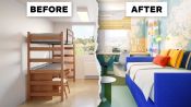
3 Interior Designers Makeover The Same College Dorm Room
Released on 08/23/2023
[Narrator] These three interior designers
have been given a photograph of an empty college dorm room.
They have free rein to design it in any way they please.
My name is Laura.
My design style is modern, tailored, and classic.
My name is Patrick and my style is exuberant,
charismatic, and colorful.
I'm Xavier and my design style is purposeful, narrative,
and full of life.
[Narrator] No clients, no restrictions, just blank space.
Okay, so my first impressions of this dorm room are...
Thank God, I'm not in college. [chuckles]
That's very standard, it's very uninspiring.
This is a place where people are coming
to get inspired to learn and it's kind of a bummer
that dorm rooms don't reflect that.
I understand that dorm rooms
are notoriously bland and boring.
However, we can definitely do better here.
Everything that you do to it has to be able to be removed
at the end of the year
but that's a long time and you wanna make it your own,
and you wanna make it feel like an inspiring place
that really reflects your personality.
[light classical music]
First of all, I'd like to eliminate the idea
of these bunk beds.
Nobody wants to climb up and down into a bunk bed
every night or morning.
I don't like bunk beds.
I always feel like I'm gonna roll right out of them
and onto the floor in the middle of the night.
If you have a space that is on the smaller side,
creating different places to be
can actually make it feel more spacious.
So even though in this original space,
they did have a lot of functionality,
in that you have your bed and you have your desk
and is all in one place,
it feels juvenile and it feels cramped.
It's not very graceful, it's not very mature, sophisticated.
If we can spread it out
and make it feel more sort of luxurious.
I think that we can make a much better space
for these two college students.
I'm gonna kind of try to dismantle these bunk beds,
and most college bunk beds are actually, you know,
made up of some parts that are stacked.
You can usually unscrew them
and then move this lower part of the bed down to the ground.
So that's exactly what we're gonna do.
If we actually put a bed on each side,
we can upholster a headboard along the back
and along the top and then we can have lots
of pillows on here and just really make it feel so lovely.
And you can see already that now
it's almost like, a lounge space,
more so than just for sleeping.
It's for hanging out.
And then we can put a desk on each side
and just kind of continue that sense of symmetry
that makes it feel very calm.
If you have a daybed and then you have a desk separately,
there's more places to be in the room.
Rather than the two bunk beds,
I think it'd be a great idea to have upholstered pair
of daybeds that face one another
to create sort of a living room atmosphere when need be.
I love the idea of just a plain simple tuxedo,
custom-made daybed with some drawers underneath
for extra storage.
And thought that this fabric
which has got great utility to it,
it's a synthetic but feels like a velvet is a great color.
So I just imagined two people forced to share a room
with completely opposite aesthetic sensibilities.
On one side, the punk, one side the princess
to use some tropes.
And then I also thought picturing these
as being maybe art school students.
What would it be like if they had to DIY all the decor
in their room?
On one side, we're gonna create a wire frame form
out of some sort of, like, chicken wire
or other kind of wire mesh.
And we're gonna cover that in plaster.
So we're gonna create a four poster bed
with really tall, long spiky posts at all four sides.
And that will be able to just, you know,
chip away and remove at the end of the year.
On the other side,
we're gonna utilize the student's sewing skills
and slip cover the entire bed
in this kind of beautiful gold, myrrh velvet material.
And then we're gonna trim that out with a beautiful,
like light blue piping and tassels at all four corners.
So the second thing I wanted to address
was to have proper like workstation.
I'd love to see a desk that sits by the window.
There's a beautiful view out there
and I think you'd wanna be as close to that as possible.
I love birch veneer.
I think it's a really natural, beautiful product.
And I chose some white file cabinets from West Elm.
I would love to figure out some way to make
that HVAC unit feel more integrated into the room.
So I'd actually like to continue that same surface
behind both beds as a built-in shelf basically.
And so as you're lying in bed,
you could put a glass of water back there,
you could put a book or something like that.
These students are obviously very handy
so they can create their own desks.
On one side, I'm gonna build a desk out of plywood.
I'm gonna stain that plywood with kind of,
like, a dark black stain to pick up the grain
of the plywood.
And then I'm gonna wash it over with some colors.
Now for the desk chair on this side,
a very common first year art school project
is to make a cardboard chair.
So obviously, we need to have a cardboard chair.
On the other side, I decided to create kind of,
like a nice floating desk with some nice gold chain
up to the top.
Obviously, knowing this student, they're gonna slip cover it
in the gold fabric with the tassels and the trimmings.
And for the desk chair there,
I used one of the ash pillow chairs,
which is kind of a fun little, like, poofy chair
in a very like beachy red stripe.
Paired with the desk I chose two Panton chairs
from Design Within Reach.
It's light, it's playful, and can be moved
around the room easily.
I thought it was a great combination
with these two round tables from MoMA
and can also be taken with you on your next journey.
I would love to bring in a really interesting chair.
Something sculptural, has a beautiful profile.
I'm thinking specifically of these chairs
from a Baltimore maker called Crump and Kwash.
They have a really cool rounded back
and an upholstered seat.
If we have something in that space
that feels really special,
I think it really goes a long way
to making those college students
feel like they have a unique space
that is intentional and that they feel can really be a space
that they can call their own.
[light music]
So in my college I had concrete block walls [chuckles]
and concrete floor, which you know,
in a sort of minimalist way could be cool
but it just kind of felt cold and industrial.
Floor in my dorm was like that, you know,
horrible vinyl tile.
I think it was like a speckled gray. Everything was gray.
Pattern on the floor brings me back to my first days
at school thinking how am I gonna make it through here?
There's nothing warm or inviting about it.
It feels like a place that I can't wait to get away from.
And we can't do anything permanent thing with the floors.
We can't rip these out and put in something more attractive.
But we can put down a beautiful rug
and I would love to get a really cool vintage rug
is going to automatically give some personality
and some great texture to the space.
They're super sustainable 'cause they already exist.
A really big rug that continues over the entire floor
actually makes the room feel more spacious.
When you have a tiny rug, it sort of feels
like a little floating island in the middle of the space.
It makes it feel like your room isn't big enough
or that the rug isn't big enough.
When I was in school in Providence,
we had a lot of discount warehouses and one of them
was a big discount carpet warehouse
where you could actually buy, you know, big squares
of carpets or length of carpets were pretty cheap.
Both of these students are taking a trip probably
in separate Ubers to go to the carpet place.
And on one side we're gonna do,
like, really sort of beautiful red carpet,
classic kind of regal to sort of like compliment this kind
of fancier side of the room.
And then on the other side I want to do,
like a really rough kind of, like, high pile black shag
carpeting that's gonna create this like fun, you know,
furry ground to stand on.
I definitely wanted to cover these bare floors
with something that was cozy and utilitarian.
I partnered with Aronson's carpet, my go-to resource
for squares of broad loom wool
that we could then piece together
to create a grid-like interesting pattern on the floor
reminiscent of farmland from the bird's eye view
when you fly over.
[light music]
We have to think of a way to address the design
without being too permanent.
And one of the great hacks that I love
is to actually do an upholstered wall with liquid starch.
If you haven't heard of this before,
it's actually really cool.
So you just paint the wall with liquid starch,
you put your fabric on and then you paint
on more liquid starch, you get a little mini squeegee
and you squeeze out all of that liquid starch
and then it just dries,
perfectly maintaining the original texture.
And in this case, I think I would love to do something
with a really kind of fun but simple pattern
where you can still feel like you can add more personality
to the room.
And the best part is that you can take the fabric down
and you can wash it and use it again.
So it's zero waste and really inexpensive.
And if I can do it, you can do it.
So I'm imagining these two roommates
and their boring aesthetics.
On the left side, there's this one reference image
that I found of Andy Warhol's studio sometime
in the '70s or '80s.
He had covered the entire thing, wall ceiling,
every piece of furniture in tinfoil.
I thought, what better material than tinfoil
that you can get at the grocery store
and you can kind of cover anything with it.
So I'm having this student cover all of the walls
in the ceiling in tinfoil and I'm gonna attach it
with this aluminum foil tape
which you can also get at the hardware store
and it's gonna create this amazing reflective,
you know, super cool, wrinkly texture.
But then also with this kind of structure of a grid
that I'm gonna create with the aluminum foil tape.
On the other side, I think we have, you know,
maybe a textile major or a fashion major, somebody new
who knows how to work their way around a sewing machine.
And so they're gonna go to the fabric store,
I'm gonna have them get a really beautiful,
peachy colored silk velvet,
something with a lot of sheen to it.
And I'm gonna have them make a drapery
that's gonna hang from the ceiling all the way
around the walls of that space.
I thought it'd be great to bring wallpaper
from a company called Muse.
It's a non-permanent wallpaper and I thought that the use
of the world map would be a great idea
to bring these students' attention to the world outside them
and to think globally.
So I decided to wrap onto all the walls and the ceiling,
and right over that AC unit.
By wrapping walls in a ceiling in the same paper,
I always feel like the eye travels further
and the volume becomes larger.
This little heater box that stuck on this back wall,
they're both gonna kind of create a little bit
of a slip cover for this with a probably a cutout
around the vent so that the air can still come out.
So on the one side, probably, like, a green faux fur,
and then on the other side continuing using that velvet
from the curtains from the drapery.
[light music]
This light is an unfortunate thing. [chuckles]
The placement, it bothers me that it's off center.
It's one of those horrible like fluorescent ceiling lights
and it's very clearly on one side of the room.
That pesky light that we couldn't change.
One of my favorite designers, lighting designers
is Ingo Maurer.
It tried to emulate one of his fixtures
by taking three layers, white transparent fabric
and suspending them in a gradation form down
so that it looked sort of like a cloud.
I think in order to address this light on the ceiling,
I would love to have a fabric sort of canopy
that sits over the light fixture is gonna distract
from the fact that it's actually off center.
This canopy can actually be the same width of the window
so that it can feel nice and symmetrical.
Not only does it improve the look of the light fixture
but it actually will improve the way that light
is sort of diffused throughout the whole room.
I just had him paint kind of a relief
of a grasping hand on there which is a little scary,
little punk, little, like, horror movie.
I think that would be a kind of fun antagonistic gesture
to the space next door.
So for the other lighting on this half of the space,
I wanted to, you know, echo this kind
of like human body part element theme.
I got these two kind of like desk Ikea lamps
that are little globes and had them painted as eyeballs.
So there's kind of like these eyeballs coming off
of the wall.
The cords just kind of trailed down and plug it
into the outlet down there.
That gives another little spooky horror show,
punk element to that lighting scheme.
On the other side, I made this like kind of fun obelisk out
of just a wire frame and some wax canvas
and that we would use as a lampshade basically
over whatever light base you could get from Ikea
that'll kind of create a fun little glow.
But then it's also this kind of very formal,
beautiful, pointy form that will sit on top
of the kind of a cool half column plaster, a side table.
We would love to put sconces, plug-in sconces
'cause we can't do anything hardwired
that can mount right on the wall
so that each student can have access to light
and then they can have even more floor space
because they won't need like side table
to put a proper lamp on.
Over the workstation desk,
I chose two Jean Prouve Petit Potence light fixtures
that are industrial, clean, and easy to use.
I thought that it was a great pairing with the Prouve
to mix the GL day lights that are really colorful and fun.
They're playful, they're youthful,
they're also highly indestructible.
[graphics whooshing]
[light music]
The last thing, it's kind of like the jewelry of the room
is the decor.
And I would love to have on this daybed lots
of beautiful pillows and beautiful fabrics.
And I'd love to also do some plants flanking the windows.
We could have some really cool wall planters.
Plants over time can sort of drape and trickle down
and really feel very welcoming
as you're walking into the space.
If you are in college and you're not necessarily
in your room very much, something like a pothos
is gonna be perfect for a wall hanging
because they actually put up with a lot,
they're very forgiving but they also drape really well
and they don't necessarily need as much direct light
as other plants do.
And then they also will not die on you immediately
if you forget to water them when you go home for Christmas.
I also wanna add cork that runs along the perimeter
of the desk for mood boards or for reminders.
Cork is a great material.
It's easy, breezy, inexpensive, looks great.
The window shade, I thought it would be great
to use bamboo roll up.
They're easy, they're classic, inexpensive, pallet wise,
tone wise was really nice with the desktop and the cork.
On the daybeds, I chose some pottery barn,
white cotton quilted blankets that can be easily washed
and paired those with Paul Smith striped pillows
in this yellow, and blue, and orange.
It has great movement.
I definitely thought that we needed some shelving in here.
So I decided to use Vitsoe shelving,
one of my favorite systems designed by Dieter Rams in white.
They're great because they're an investment
but you can take them with you
once you're completed your college studies.
So our very element of this room is sort of already decor.
This is just starting out this semester.
Just imagine what's gonna happen by the end of the semester.
It's gonna be even crazier.
The one thing I did wanna add is something reflective,
some mirror I think.
And on this side, a very traditional mirror element
and a lot of very fancy old houses
is this kind of like beautiful gilt convex mirror
that you would see, you know, at the top of a staircase
or about a mantle.
We can't afford that because we're college students here.
So I found this convex traffic mirror
that you'll often see driving to look around the corner.
So it kind of accomplishes the same thing.
It's got a really nice red frame around it
and I think it looks perfect in this space.
[light music]
So I love how this design is coming together.
I would want this to be my dorm room.
I'm quite jealous that it can't be my dorm room.
It feels really warm.
It feels like a home away from home,
which is really what I think a college student
is looking for.
And yet it feels open and light enough
that each student could bring their own personality
and they can put their own artwork up on the walls.
So looking at this, ultimately it's a little crazy
but I actually think these two halves kind of speak
to each other in more ways than one.
And I think they actually kind of work together,
even though they are so completely different.
Every single thing in this space, you could buy
at Dale Store, The Fabric Store
at Home Depot pretty accessible to a college student.
Maybe you need a little modest budget to do it.
I think these students are obviously so different
as evidenced by their competing halves of the room.
They probably start off the semester day one in conflict
but I'm pretty sure they end up in love with each other.
Overall, I think the dorm room feels academic, global,
interesting, and soothing at the same time.
My hope is that this room makes these students dream,
think outside themselves
and how they might make their imprint on the world.
[gentle music]
Wow. Oh.
Oh my god, now we're talking-
I love it. The dorm room.
Amazing. These are the best.
That is something.
What's happening on your wall?
[Xavier chuckles] What's going on?
Okay. Yeah. [Laura laughs]
'Cause a lot, a lot. What's going on?
Yeah. Like Xavier here.
[Laura chuckles]
Okay, so you don't get to pick your roommate.
I mean, I didn't at least. Right.
But the princess and the punk,
what would happen if they just couldn't compromise at all?
And so just, I decided to split it down the middle.
[Laura] Yeah.
I love this map thing that you've got.
You know, I felt like let these kids look out
into the world. Yeah.
And imagine where they want to go,
where they want to travel and experience.
And I guess I envisioned like two little twins-
[all chuckle]
going off to college and they'd be exactly on the same bed.
You both did something very clever
with the light, I think.
It was off center. That's awful.
And it was just like, ugh.
So yeah, similar to Patrick, I draped fabric over it
to kind of create, like, a cloud-like effect above you.
[Xavier] That's beautiful.
And then the walls are actually upholstered in a fabric.
And I love the idea of like creating, like, a daybed.
I think we kind of both did the daybed thing. Yeah.
Yeah, I think it's, you know, invites you
to treat your room not just like a bedroom,
but to sit and have conversation.
My actual dorm room was kind of just sad
and small, and dark.
[Patrick] Yeah.
I never spent any time in mine.
Yeah, well, that's the thing-
Yeah, yeah.
You don't end up staying there
'cause you're just like, Well, I don't wanna be here.
This is, you know. Get me out.
Mine had a view out to the highway.
[Laura laughs]
so depressing.
It's like really inspiring. Yeah.
[chuckles] I thought you were gonna say something else.
I thought you were gonna say a view out
to something like nice these.
No? No.
These will had a nice view actually.
They didn't have a nice view.
3 Interior Designers Put Their Spin on the Same Luxury Loft
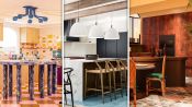
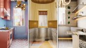
3 Interior Designers Transform The Same Kitchen
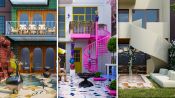
3 Interior Designers Transform The Same Soho Loft
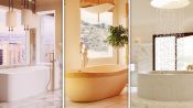
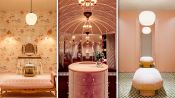
3 Interior Designers Transform The Same Luxury Bathroom
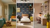
3 Interior Designers Transform The Same Bedroom
3 Interior Designers Transform The Same Home Office Space
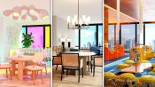
3 Interior Designers Transform The Same Dining Room
3 Interior Designers Transform The Same Foyer
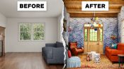
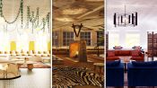
3 Interior Designers Transform The Same Cozy Living Room
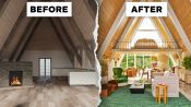
3 Interior Designers Transform The Same A-Frame Cabin
3 Interior Designers Transform The Same Walk-In Closet
3 Interior Designers Transform The Same Kid’s Bedroom
3 Interior Designers Transform The Same Galley Kitchen
3 Interior Designers Transform The Same Backyard
3 Interior Designers Transform The Same Basement Rec Room
3 Interior Designers Makeover The Same College Dorm Room