- Space Savers
- Season 1
- Episode 10
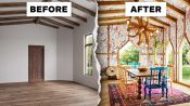
3 Interior Designers Transform The Same A-Frame Cabin
Released on 03/15/2023
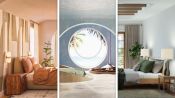
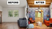
[Narrator] These three interior designers
have been given a photograph of an empty A-frame cabin.
They have free reign to design it in any way they please.
Hi, I'm Darren Jett and my designs are atmospheric,
immersive and always full of life.
My name is Chiara
and my design style tends to be warm, modern.
My name's Jenny and my design style
is colorful, unique and thoughtful.
[Narrator] No clients, no restrictions, just blank space.
I think that there's endless opportunity with an A-frame
and there's a lot going on here that I think takes away
from that opportunity.
My first impressions of this A-frame
is that it's actually so cool.
I love the geometries, I love the wood, I love the warmth.
It's not that inspiring,
it's just kind of your typical A-frame cabin.
There's some natural elements, a lot of wood
and not a lot of light.
If I'm going to the country for the weekend,
I would love to just be surrounded by nature
and surrounded by light so I think it might be cool
to explore actually removing the wood
that's in between the beams and perhaps replacing that
with the material that's sort of translucent.
Perhaps we could do something
like a polycarbonate thermal glass.
I think overall this is a very atmospheric material.
It lends itself to something that's a bit more modern.
Someone like Steven Holl, who's a fantastic architect,
has used this on a few museums
and if you go past one of these places at nighttime,
it almost glows up like a lantern.
For the walls as they are here now,
I am not comfortable with the asymmetry.
I would want the drywall to carry up
and be even on all sides.
I would want something very reflective on the walls
to bring in the light from outside and I would love
to see a lime wash finish on the plaster walls.
An easy way to brighten up the space is with paint.
So rather than painting the space a singular color,
I went for a few different shades of paint
and the idea was almost to treat this A-frame
as an art gallery, kind of this white box
that was grounded in this warm white color.
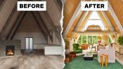
I kept thinking of an alpine A-frame lodge
and I didn't want anything to feel too dark
with the finishes or the surfaces,
so I thought something light,
this is actually more of a bleached pale European oak,
I thought that would be really pretty and not feel so heavy.
I thought the beams just look really heavy,
so we decided to white wash the beams
so they have a similar tonality
to the warm white harvest moon paint color
that you see on the walls.
In this instance, I really wanted something fresh
and clean and light and bright
and so I decided it would make more sense
to have white plaster for the beams as well
in the same finish as the walls.
I just think that would be a cleaner
backdrop for everything.
Right now the door just looks a little small,
a little traditional.
I really want to freshen this place up,
so I want to essentially create a more modern language
and something that's just a little bit taller
to let more light in.
I think it would be really cool to actually have
perhaps two doors and maybe those are actually flanking
the center of the cabin and that would lead you outside
to perhaps your patio, your pool or your hot tub.
It would also create a nice path of circulation.
So in this original room they bring the drywall up so far
and then they finish it with the wood beams
and I think that's a bit awkward.
I would wanna get rid of it all,
blow it out and have it all be glass window.
I'd really like to just take in a beautiful view
and have this feel like a real alpine A-frame.
Right now what I see on the floor,
it looks to be a very short plank wood floor.
There's nothing wrong with that,
but I do think what I see as a challenge in this space
is how to make it feel a little bit more fresh
and what I would like to do is actually
remove the wood flooring
and put down concrete floor instead.
I would pigment it to be a very warm color
and underneath it would allow us to actually
have a radiant heat source
so that when it's wintertime everything is very cozy.
I would really love to bring in a beautiful
reclaimed limestone in a light color.
Limestone, of course, has a variation,
but I would try to use a very creamy palette
and I think personally I'd also try to do some radiant heat
so that it doesn't feel too cold
on the feet in the winter months.
So for the kitchen, I'm going with this hunter green tile
by Fire Clay.
It has like a really nice matte finish
and I went with a square shape and carved out
the flooring of the kitchen and it was really important
for me to bring in elements of nature
since this is an A-frame cabin,
I'm imagining we're somewhere in the country,
away from city life.
So on top of the concrete floor I would love to have a rug
of some sort that would just provide
that extra sense of warmth and that extra sense of place.
Perhaps we sort of lean into the cabin aesthetic
a little bit, let's not go too far overboard,
but let's still have a little bit of fun.
Perhaps we do something like a skin or a hide,
something that's really soft to where if you are on a sofa
or you're on a piece of furniture,
but your friend is next to you and they're curled up
by a fire reading a book, you're actually on something
that's very soft and cozy.
So with the floors in the original rendering,
it's kind of this midtone wood
and I decided to strip the floors
so the floors just are an extension of the walls
and I'm just creating like clean backdrop
that's kind of this galleryesque space.
I love this kind of mossy green rug.
It's a high low pile and it's really, really soft to touch
but also it's bringing in the green from outside
and I just feel very inclined with this view of treetops
to try to bring that in as much as possible.
The cabinet itself is not too big
but it has a ton of ceiling height.
If I'm coming up here for the weekend,
I would love to have my bedroom space
sort of separated from everything else,
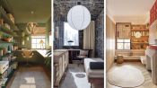
so why not actually use the height to hour advantage?
Create a sort of lofted space above
that can be totally private,
maybe it's only your bedroom, maybe it's very, very zen
and you're just giving a little bit more square footage.
The ceilings are so high,
I'm inclined to want to loft a beautiful bedroom up there.
I would love for that backdrop to be the floor
to ceiling windows and just have a very simple bed
and beautiful bedside tables set up against that window.
So for the second floor loft space,
I used this kind of champagne frosted color glass
at the front of the loft space
and I just thought it was a nice way
that you could kind of see into the space,
but also the frosted glass offers some privacy.
I think a place like this
where you're probably just going for the weekend,
you can keep everything just very simple.
So let's say that there's just a bed in the loft
and maybe it just faces out over the living room.
I am wary of spiral staircases,
so I really wanted something a little bit more substantial,
but I didn't want it to take away
from the space that I needed in this design.
So I thought a beautiful plaster spiral staircase
would kind of be that perfect medium between the two needs.
In the area between the two doors,
I would love to do something that's just a little bit
more sculptural than an average spiral staircase
and I think here what we could do
is sort of create a ribbon effect.
Imagine that your banisters are completely infilled
and in between you have sort of plaster banisters
that go up.
As for the staircase,
I just wanted something simple and subdued.
I did a black spiral staircase, but I didn't want it
to be focal so I extended the tile wall
so you can see that the staircase is kind of hidden
behind the tile wall in the kitchen.
In the original A-frame, I don't understand this kitchen,
it's taking up the entire space.
Instead, I would just run the kitchen along the wall
and put everything that one needs centered off that one wall
and not encroach upon the space any further.
I would keep the general idea of the kitchen
living along this long wall here,
but I would eliminate this sort of island happening here.
I think that whenever you're in a small space
you want everything to feel sort of open.
Because we're eliminating some storage here for flow,
why don't we put some of that up here,
kind of on the wall as an upper
and that would provide just extra space for food,
for plates, for things like that.
So looking at the original kitchen,
it's pretty generic so I wanted to think of materials
that kind of had a neutral feel
that were a bit more elevated.
For the countertop, I went with this really unique marble.
It has some hints of beige and purple and blues
and for the cabinet and the island, I chose particle board
which is a really inexpensive material.
I was inspired by cabins from the seventies.
Everyone wants counter space to work on,
so I decided that the dining table
would also serve as counter space.
It's a vintage Guillerme et Chambron Folding Dining Table
and that pine made me think of a Swiss chalet.
If I'm hosting people,
I want to make sure that they all feel comfortable.
I wanna make sure there's a ton of seats
and a big table to have beautiful meals all from the garden.
So why don't we create a large table?
Let's maybe sit at minimum eight people.
A table in a place like this, I think, should also be wood.
I am roasting a chicken
and my friend spills a bottle of wine or whatever.
If it's wood, that's totally fine
and I actually sort of want those moments to happen.
They create stories.
I'd like to think of this space as having different areas
for different times of the day and different activities
and I love this Green River Project Game Table
and this way you don't have to do your games
or your chess or your checkers or your puzzles
or any of that on the dining table,
but you have kind of your own sacred space.
There is this carved out area here on the right.
If we think about perhaps doing floor ceiling bookcases
for instance in the same material, how cool would that be?
The back of the bookcase would be flush with the wall
on the right and the top would go to the underside
of the portion here where it flattens out.
In this case, I felt like the existing fireplace
was protruding too much into this space.
I was inspired by the work of Arnell Binwa
who is a ceramicist and she's done beautiful custom mantles
and I thought here was an opportunity
to do one that just blends with the lime wash
but doesn't totally disappear
because it is the meeting point in this space.
So for the fireplace,
I decided actually to keep the existing fireplace.
It's what grounded my inspiration
and I built the rest of the A-frame off
of this existing fireplace, leaning into this natural stone.
The angle of the fireplace creates a sense of place
in the living room and kind of separates the living area
from the dining area and kitchen.
I like that.
The thing I don't love about the fireplace
is that it just feels a bit fake to me.
I think if we did something
that was sort of tectonic in a way,
that could be very cool.
Perhaps we do these sort of rocky forms that are flat on top
that have a kind of rusticated edge on the face.
The shape is very conducive to being open to the dining area
even though it does create a sense of separation
because we're angling it.
I think a comfy sofa is so important
and using a comfy upholstered skirted sofa
in this kind of angular A-frame that could veer more modern,
would soften it a bit.
I am using this Maison C pattern called Betcheva
and it's a really nice repeat 'cause it's not too busy
but it adds just a really beautiful plateful floral moment
and then I made a custom hexagonal table.
I've wanted to go with bolder accents
and furniture pieces and the couch
that I'm going with is the Togo Sofa by Lean Rose.
It's a fan favorite.
I went with the mustard corduroy fabrication.
This coffee table is by Lucas Mordin.
I sourced it on 1stDibs
and I loved the hand anodized aluminum finish.
I love mixing finishes in a space and I just thought
this would be a really interesting texture
to bring into this space with the wood
and the stone floors and the rug.
I really want to create a sort of communal sensibility.
Think about you're almost at a camp
and you're around the fire or you're around a table
and you're all having conversations
and just having a good time.
I think if we have a sofa,
something like the Pierre Yovanovitch sofa for instance
that has these sort of angular lines creating different
kind of views and different situations for seating,
that could be something that's very cool.
This coffee table, I love,
it has kind of this like organic kidney shape.
It's a really nice size, it's long.
You could probably eat at it, have hors d'oeuvres,
drinks with your friends and I paired the coffee table
and the sofa with our teddy chair by Pieces
and this kind of custom mossy mohair color.
We're introducing a lot of modernity into this cabin.
We're making it feel fresh,
but I always want to still keep the sense of place.
This particular table, I would love to do something
that's more of a shou sugi ban wood
and that's essentially a charred wood table.
Again, it sort of lends itself
to that cabin aesthetic, campfire.
The chair is a really beautiful French Neapolitan
classic fringe chair and I did it in a beautiful
Zak+Fox mossy green velvet.
I keep seeing the space as very seasonal,
so in the winter it's really soft and cozy and inviting
but then in the summer you're picking up on the greens
and what's outside.
Because of the way that the sofa
is orientated towards the fireplace,
there is a sort of opening on the other side of the room,
perfect for another lounge chair.
Whenever you have a lounge chair
that's sort of situated in a kind of corner
but you can sort of walk all the way around it,
always fantastic to think of it
as being more of a sculptural moment.
The chair that I'm thinking of
is the Benetti Chair from Bonacina.
It's another chair that is actually a wicker material
but the form is just really fun.
Along the wall I put one of my favorite sofas,
it's called the Dog Settee and it's by Howe London
and this fabric is very, very, very durable
and the whole concept behind it
is that your dogs can sit there as well as you.
Next to the lounge chair,
I would definitely add a sort of cocktail table.
I like something like this that's a simple bronze material.
Perhaps it's hammered to give more of that
kind of old effect, but really the function
is super important.
You always wanna have a table next to a chair.
If you have a drink, if you have a book,
you wanna set it down on something.
I also added this, again,
pine Guillerme et Chambron Secretary to the room
and I thought this is kind of a great opportunity,
you can have a bar or a desk to write letters
or get some work done, but I like the duality to it.
I chose the USM Holler piece, the credenza
and I did it in this kind of slate gray color.
I thought like the neutral gray paired really well
with these brighter furniture pieces
and it's just a really great piece
to store your linens, your serving wear, et cetera,
just to keep everything really clean and organized.
In regards to lighting,
over the dining table because we are turning it
in sort of this fashion that's up against the wall,
I would like to have a linear light that goes above.
This particular one I'm thinking of is a Franz West design.
It's actually sort of tectonic in a way
with these exposed light bulbs on the end.
My favorite lighting are these pebble pendants
by Anne Light, Anne Light's one of my favorite
lighting designers and I think the pebble collection
is just striking and it worked so well
with the stone fireplace.
It had a very earthy feel,
just perfect for this A-frame moment
and made the space really cozy
and the lighting from the pebble pendants
is just very warm.
I think it's always great when you have a kitchen
that has uppers, to integrate your lighting
underneath those uppers.
You really wanna light up your working space.
So having lights underneath your uppers
is a fantastic and very easy solution.
So with an A-frame, I'm a little intimidated by lighting
because even with the loft, the ceiling is high
and now we've brought in so much natural daylight
that over the dining table there should be something
really beautiful and decorative that provides
a nice amount of light,
but it doesn't have to be the sole source.
So I sourced these vintage Hansen Jacobson pendants.
For the kitchen island,
I'm going with a valve pendant also by Anne Light.
Super clean lines, a really modern lighting piece.
Nothing too loud or bold, but I love the shape.
So the chandelier of the living area
is by Martin de Selluer.
It's called the Sundial Chandelier
and that's because it is made up
of all of these individual disks
and the disk are actually lit on top
and they shine up and they sort of create
a sort of sundial effect from the central post.
I think it's important to do sort of dramatic moment
like this in the living area
because entertaining is so critical
to the idea of this weekend retreat
and I'm also just imagining pulling up at night
from the city when I'm driving in,
I've put that light on my phone so I can turn it on
and that's really glowing the house
when I'm coming into the driveway.
I've really entered the world of pine
and I loved these Swedish all wood
with paper shade sconces.
I just thought those were beautiful
and I can imagine that the light
would be very, very warm that they would give off.
So I went the full length of the A-frame.
I'm relying on these added layers
to create the overall lighting together.
I love offering different light options
to have ambient lighting, especially in the evening
and this is Noguchi Floor Lamp, another classic,
one of my other favorite lighting designers,
I feel like you can't go wrong with anything Noguchi.
The paper cast just a really beautiful glow.
Whenever you have a seating group like this,
I always, always, always recommend
having reading lamps next to your seat.
These particular lamps that I'm thinking of,
they're actually the Delphine Light sold at Floss
and they're adjustable and they're perfect for curling up,
reading a book, just setting a little bit of mood too.
With the A-frame you don't have a lot of wall space
to go crazy with artwork but I did want something
really beautiful and textured and warm
to kind of serve as some sort of visual on the wall
opposite the kitchen where the dining table is
and I love this Egyptian tapestry.
It picks up on the colors that I have inside
and I think a tapestry too for sound and warmth
is a really cozy addition.
The planter are the column planters by Pieces
and we designed them so they're stackable.
I did all three colors that the column is offered in
and I've just thought like the planter on its own
is almost like a nice art piece.
I think that in most spaces they always benefit
from having plant life.
They provide a sense of mystery.
If you have something that's kind of tall,
it creates a sort of spatial moment.
I like to mix my plants, I love to have a big palm tree,
I love to have smaller ferns.
Since there isn't a lot of art space.
My partner, Maison C is an artist and she does murals.
Her name is Castanza Tedolbranski
and so I thought it would be fun to have her do
kind of like a vine up the mantle.
Again, bringing in the green from outside
and having this kind of be a little bit more
of a magical little touch to this mantle.
The books and objects
are always very important in a house.
I'm imagining there's a plethora of coffee table books
and design books and art books
and things that you maybe have no idea
that you have an interest in and that you're visiting
for the weekend and you pull something out
and you're like, Oh my God, this is so cool,
I'm gonna sit down and read about it.
I really love this A-frame.
I think it's a nice mix of bringing nature inside
and it's blending in a lot of modern and clean lines.
I am very happy with it.
It mixes all the textures and colors
and creates a really beautiful environment
In the end, I really love this design.
You have a beautiful effect that every morning
when you wake up, the whole house kind of glows.
I think it's a really perfect retreat
and I could just imagine spending probably a little bit
too much time here.
[lively upbeat music]
Wow.
Oh my God.
Okay, this is cool.
Yeah. We are all so different.
What is that?
What is the ribbed glass?
So it's actually a polycarbonate insulated glass.
Oh, cool.
So kind of like Steven Holl,
something like the Acne Stores you might see
they have this material.
[Jenny] It's really eye catching.
And I love how you actually
also sort of went a bit more modern too.
I love that citron, it's such a pretty-
The yellow and the greens work so well together.
So it was like these natural colors
juxtaposed with brighter colors
to kind of feel like an art gallery.
That's so cool.
You also did kind of the same thing
with a kind of a wood
with some of the greens coming through.
Yeah, I kept thinking this could be upstate
or even in Europe, like a little chalet
and bringing the outdoors in was really important.
I love that sort of forced perspective
that you created too by keeping the walls clad in wood
but you blew out that back wall.
Exactly, I really wanted the focal point to be the view
and bringing that in as much as possible.
I would totally live in either of these.
I think they're both very soothing.
Just this fantasy world that I would love to spend time in.
I would love to just honestly make a meal in your kitchen.
It looks so nice and just really cozy.
I love the materiality.
I can just see myself cooking nice meal for all my friends.
I don't cook in the city,
but when I go upstate or when I go somewhere
like a cabin like this, all the skills come out
and I just wanna show off.
And yours, I'm just obsessed
with the whole fireplace moment.
I really wanna curl up with a book
and just doze off and not have a care in the world.
It's so zen.
Yeah, so, so, so zen.
I could easily dive into either one of these settings,
this is this warm, modern, sexy vibe
and then I agree like I am terrible about cooking
and doing much in in the city,
but when I go upstate and escape,
that is exactly the kind of place I would love
to cook and again, entertain and just chill out.
It's very happy.
Those colors are really happy.
[Darren] Yeah, I feel good looking at this.
3 Interior Designers Put Their Spin on the Same Luxury Loft
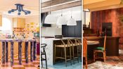
3 Interior Designers Transform The Same Kitchen
3 Interior Designers Transform The Same Soho Loft
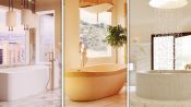
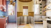
3 Interior Designers Transform The Same Luxury Bathroom
3 Interior Designers Transform The Same Bedroom
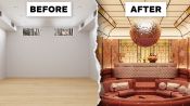
3 Interior Designers Transform The Same Home Office Space
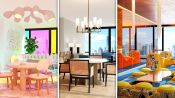
3 Interior Designers Transform The Same Dining Room
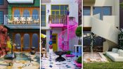
3 Interior Designers Transform The Same Foyer
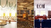
3 Interior Designers Transform The Same Cozy Living Room
3 Interior Designers Transform The Same A-Frame Cabin
3 Interior Designers Transform The Same Walk-In Closet
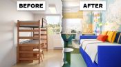
3 Interior Designers Transform The Same Kid’s Bedroom
3 Interior Designers Transform The Same Galley Kitchen
3 Interior Designers Transform The Same Backyard
3 Interior Designers Transform The Same Basement Rec Room
3 Interior Designers Makeover The Same College Dorm Room