- Space Savers
- Season 1
- Episode 7
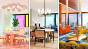
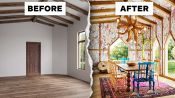
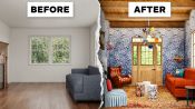
3 Interior Designers Transform The Same Dining Room
Released on 01/17/2023
[Announcer] These three interior designers
have been given a photograph of an empty formal dining room.
They have free reign to design it in any way they please.
I'm Noz.
I'm an interior designer,
and I would say that my style is colorful,
and layered, and a big eclectic mix of styles.
I'm Erick, and my design style is warm, earthy,
and inviting.
Hi, my name is Mandy,
and my design style is California modern
with touches of vintage and organic materials.
[Announcer] No clients, no restrictions, just blank space.
So at first, looking at this space,
it feels like there's warmth already,
but the windows look a little small,
the door feels a little bit small,
and it just overall needs some character.
So as I'm looking at the space,
I am so drawn to the backyard.
I'm so drawn to the land outside these windows,
but the windows are so baby tiny,
so I wanna bring more glass.
Like I want there to be more.
Here in the original space,
I love the wood finishes in it,
and I really love that you can see the outdoors.
I love seeing the trees out there,
it feels like this home is kind of nestled
in a very green, like foresty area.
And I do like the vaulted ceiling.
Kind of the unique architecture of the room.
[upbeat music]
So in the original space, there are these small windows
that aren't really doing much for the space.
And I thought the wall was such a focal point,
that adding some stack back doors that were Louvered
was really gonna allow some more light to come in,
and just make the space connect to the exterior,
so that it really felt like you were living in the outdoors
and indoors all at once.
I love large openings for like doors
and passages 'cause it makes the space feel grander.
So with the doors here,
I really wanted to take them up as high as possible
where it was just gonna completely open up the space
and make you feel like you were outdoors
at all times when you're having dinner.
So in the original design,
the windows are, they're just a little weird to me.
Like what's with the little box under one window?
They feel a little small.
They're kind of a strange shape given the size of the room.
So I really want to open them up, get rid of the weird box,
and make this whole room
feel a little bit more indoor-outdoor.
So I'd like to blow out those windows, add a bifolding door,
and build a deck.
So you could kind of imagine like dining inside,
being able to easily navigate outside,
or if you have kids, they can run out and play,
and you can keep an eye on them,
and it really just makes this room
feel like an indoor-outdoor flow.
A design aesthetic that I love is just mixing wood species.
I feel like in nature,
you see a whole bunch of different types of trees together
and they look really pretty together,
so I love mixing wood tones.
And given that the original space
has a pretty kind of medium-toned wood,
I would like to add more of it.
So I really love this backyard.
I love the idea of there being more to see over here.
The windows are great, they're tall.
It's is a really tall wall,
but I wanna make everything bigger.
I wanna make the windows larger.
And I wanna make them more interesting.
I love the pitch of this vaulted ceiling here,
and I wanna repeat that,
and play with that form in the windows on this wall.
And then all of this wood, like all the muntins,
all the ways that the glass gets broken up
which interrupts the view, we're just gonna do pure glass.
Like just straight up glass, and tons of it.
I am going to put curtains around my bifolding door,
because I can tell that once I open up that wall
and add this detail around the bifolding doors,
it's probably going to feel a little bit sterile.
So I'm gonna add curtains.
I'm thinking kind of like a light powdery blue.
And I'll mute it a little bit,
and that way it will kind of class up the space.
Well, I don't like the door.
The door is sad.
It feels off-center.
It doesn't feel like related to anything.
You can also see the door is actually
like shorter than the window height over here.
That feels a little bit silly.
So I'm thinking that for this area
in the back of the dining room, I wanna open that up.
I wanna make the light come through.
So I'm gonna do another house-shaped window
that echoes everything happening on the right hand wall.
The dining room, I want it to stay cozy,
which means that the walls don't open
in my little dining room.
So they're just gonna be windows.
When I originally saw the door,
it just kind of fell out of place,
and I wanted to give it purpose.
So I wanted to give an illusion of the house continuing,
and connecting to the rest of the spaces.
So it just continues,
and it makes the space feel even larger.
Initially, I was just gonna change the door and remove it
and just create a hallway,
but then the scale wasn't right with the rest of the room,
so opening it up a little bit more
was just gonna make it feel a little bit more approachable.
And there's also a curiosity to it
where you kind of wanna go around the corner
and see what's next.
[upbeat music]
Obviously, there's so much potential in this space
for us to do something really gorgeous with the walls.
I myself am also into the idea
of doing something that feels expressionist and painterly
but environmental, all the way up onto the ceilings, too.
And I'm thinking something that has
more of a botanical energy,
something that has a little bit more
of an earthy color tone would be good.
So I personally think
that this Pierre Frey wallpaper is gonna be the vibe.
Like, you know, like I love that there's
like a gouache watercolor kind of energy
to the print on this.
You can really see like the brush strokes,
which is beautiful.
And then all of the earth tones
really vibe for me with the backyard.
It's like kind of giving like a really colorful plant hug.
So originally, the walls were kind of plain and simple,
and I wanted to introduce a new element in the space,
a new material that was gonna warm it up
and really create a focal point.
I decided to add stone to the wall to make it a feature.
Right now the walls were feeling a little bit too clean.
So by introducing the stone, again,
it's very important for me to bring the exterior interior.
So adding that stone to the wall
just creates that element of, again, durability,
and something that just feels heavy and grounded,
and it becomes such a good focal point in the space.
So this is the wallpaper that I've selected,
and it's gonna go on this wall here.
Because I'm opening up this wall,
and making it a big, bifolding door,
I want this wall to be kind of like the backdrop of it all.
So I chose this really fun, modern wallpaper print.
But what I love about it is the colors of it are really warm
and rich and fun, and I love that it is hand-drawn.
So it just kind of adds to like the whimsical nature of it
while still being a like rigid square, linear pattern.
So I'm obsessed with this wallpaper, but she's a lot,
like this is a whole lot of pattern.
So I have this idea
of adding additional wood paneling onto the walls
that sort of takes what's so beautiful about the ceiling,
and we're gonna have wallpaper intercut
with all of the wood detail on that ceiling.
I love the idea of dragging that down onto the walls
all the way around the room.
That feels like a way of almost like breaking up
how energetic the wallpaper is
into something that has more form and more formality
so that it feels a little bit more digestible.
In the original room, there are beams already here,
so I wanna enhance the ceiling a little bit more
by really clatting the entire space.
This way it's gonna allow the room to really feel grounded.
And since I wanna take out the entire right hand side
and add the windows, that's gonna allow the balance
between the contemporary windows and then the ceiling
just feeling a little bit more old-world,
and making it a little bit more cozy and warm.
So I really love the texture
that we have going on on the ceiling.
I mean, I'd like to continue that.
So I would like to continue putting wood
where you currently see the drywall.
That way it kind of just feels like
you're sort of like in an upside down tree.
And I love that feeling,
it just makes it feel a little bit more intimate and cozy.
[upbeat music]
I am gonna remove the wood floor
because since I am doing the ceiling
and cladding the entire ceiling in wood,
I feel like the balance is gonna be off.
And there's something beautiful
about the mixture of the two, the wood and the concrete,
that are gonna play really nice together.
So to continue this idea of like warmth and coziness
and like a sophisticated, intimate space,
I changed the stain color of the floors.
I made them just a little bit darker
so they feel a little bit more rich and sophisticated.
I think the thing that I'm not liking about these floors
is there's just no energy to it.
Like it feels tired.
It feels like a floor that just came with the house
and you didn't really choose it.
I wouldn't choose it.
I love the idea
of going with a more active grain in a oak hardwood.
I'm actually thinking like,
we've got a couple of different options here,
but something kind of in the way of this for the paneling
married to a very dark
and rich oak floor would be really exciting.
I'm gonna do a herringbone.
It's rectangles, but they all come together.
It's such a beautiful way to do rectangular wood boards
but in a pattern that makes it really energetic.
And I like the idea of the herringbone shape
also echoing the vaulted ceiling,
and also echoing the little doghouse-shaped windows.
So we're just doing a lot of angles.
We're serving angles.
So I have this lovely rug.
This is an example of the beautiful rug
that I've laid out on the dining room floor.
And what I love about it is that it is a really lush pile,
but you could imagine it not being too fluffy
that you can't have like a dining table and chairs on it,
but it just feels very luxurious.
And it ties in so nicely with this wallpaper color,
the paint, and the wood tones that we've got going on here.
I chose a rug.
Not everyone likes a rug under the dining table.
Sometimes people think of crumbs,
sometimes people think of spills.
I love the warmth and the energy
that putting a rug under the table creates.
So this rug that I'm thinking of,
it's like sort of traditional, but if you look closer at it,
there's like fuchsia blobs in it.
It's by a designer in New York called Jan Kath.
I'm obsessed with all of their rugs
where they basically take a traditional, antique,
you know, it could be Oriental, it could be Persian,
like whatever.
They take these amazing motifs, and then in their design
it's like you've spilled paint all over it.
And then since I already spilled paint all over the rug,
then who cares if the red wine ends up next?
[jazzy music]
For the dining table, I wanna use something
that's really grand, and that's gonna make a statement,
because it is gonna be one of the focal points in the room.
I wanna use a material that, again, is very durable.
Travertine is not only durable, but it's also antibacterial.
It will, again, never feel dated.
So it stays in theme
with being able to move the furniture outdoors,
and vice versa, bringing it indoors.
So one of the things
that's really important to me in a dining space,
no matter how big it is,
is that you have somewhere to put your platters,
you have somewhere to put all of the shared drinks.
So I'm thinking of a credenza.
I love the idea of using this Studio Boheme piece.
I am absolutely obsessed with it.
I've wanted to use it forever,
and it's so freaking beautiful, right?
Like it's so geometric, but it's so curvy and fun,
and this is gonna be the place
where I'm able to put all of the wine and the champagne
and the sparkling water crock, and the still water crock.
So the dining table
is just kind of an extension of the idea
of wanting this room to feel approachable and comfortable.
So I chose a oval-shaped dining table
without any harsh corners or anything.
It just feels like anybody could walk up
and sit down, including children.
On top of that, by adding, you know,
the wood base, again, it kind of just grounds it
and makes it feel a little more approachable.
It's not too stuffy, but then having a marble top
just adds to the sophistication
and kind of classes that all back up.
So let's talk about the dining table.
When I'm looking at this room, I see a very linear space.
So I really truly think that a rectangular,
linear table makes the most sense in the space.
So I'm thinking something that's kind of like
sort of roughly this size.
This table by [indistinct] Park is so freaking beautiful.
I love how impractical and oversized the legs are,
but it's still actually
like a very traditional rectangle shape.
So for the chairs, adding in another color of wood.
So this is just unfinished white oak with the chairs,
and a blue velvet that I sourced
that ties in nicely with this wallpaper and the curtains.
And then the side chairs, I did in like a gray leather,
and I mixed and matched it
just to continue with the layering,
making it feel like an easy space to go into
and hang out in.
It doesn't feel stuffy,
but the chairs themselves are really beautiful.
Can you tell all of my clients have young kids?
It's like all I think about.
I care a lot about kids running into corners.
So a lot of the things that I source are round
and don't have sharp corners or edges for that reason.
So for the dining chairs,
I wanna find something that feels old
and that feels patinad and that has character.
So again, introducing wood
to play with what's already gonna be existing
from the stone to the concrete
will be a really nice balance.
So I'm thinking almost like an old, Windsor chair,
which is like a really gorgeous, traditional Americana
and English shape for a dining chair.
Doing that, but like making it kookypants,
'cause that's what we did with our table.
So I'm thinking like wiggly energy kind of makes sense.
There's something about it that reminds me of the wallpaper.
[upbeat music]
So these chandeliers are apparatus chandeliers.
I love them because of the milk glass,
the brass texture on them.
And rather than doing one chandelier, I wanna do two,
because this room is so long,
my table will also be quite long.
So rather than one chandelier coming down
and just lighting the center of it,
I want the whole table to be evenly lit.
So I've decided that I would like two of them
evenly spaced over the whole table.
Something that's really important to me in a dining room
is having lots of different options for lights.
I think lighting is so important in developing
and establishing a mood
and an energy for the meal that you're serving.
So I'm thinking
of adding lots of different sconces all over the place.
There's this one sconce, it's a vintage piece
that they're hands that hold light balls.
I'm obsessed.
I think they're so amazing.
I've always wanted to use them.
So I have those
kind of surrounding the perimeter of the room.
They're very subtle.
The only subtle thing in the room
With lighting, I wanna be very intentional,
and make it feel very moody and ambient lighting.
So I didn't want to put a big chandelier
over the dining table.
I wanna make sure that I source something
that's gonna feel like they're there,
but they're not really in the space.
So that when you walk in
you're not really focusing on the lighting fixtures,
you're gonna be more focused on the dining chairs,
the table, and your surroundings.
And then I was looking around for, I don't know,
I'm thinking like a light fixture over the table,
a chandelier so to speak, that has the same hand energy,
I recently saw that artist Chris Wolston
released this giant chandelier
that's literally just like a mess of arms and hands
holding balls in different directions.
So the wall sconces I just made up.
I'm gonna have to get them custom-made.
I love them because they are just going to be
kind of an ambient glow against the wallpaper.
The linear, vertical lines are kind of just,
you know, they tie into this wallpaper really well,
and by having those shadow lines,
it just kind of accentuates that grid formation.
'Cause I think that a lot of people really enjoy
how a space feels when it's lit with wall sconces
without realizing that that's what it is.
It's that ambient glow without it kind of,
you know, being so harsh over your face.
I also wanna put something in this corner.
I just, I think the corner needs something.
I love really tall floor lamps.
This one is so kooky, it's from RAM Atelier.
I think it's so amazing.
I love that it kind of like does this.
And it's made out of clay, I think.
So I'm choosing a green,
because the green feels, again, really botanical.
It reminds me of a lot of the colors outside the windows.
[jazzy music]
So since I might be changing the structure
and the architecture of the door,
there has to be another element back there
that's really gonna draw your eyes.
So I'm thinking I might add an olive tree
that again feels like it's just natural, it belongs there.
There is a lot of wavy furniture
and decor out there right now, and I really love it.
The mirror is just a fun piece
that helps to make the room feel a little more fun
and funky and like whimsical.
I plat it in wood
so that it still feels like it's tied into the space.
I wouldn't be complete without something on the table
that sits there all the time,
even when I'm not serving a meal,
that is still also an art moment.
So I'm gonna go with
this bowl that I've admired for so long from Rogan Gregory,
he's one of my favorite contemporary artists
who lives in Los Angeles.
And it's this like amazing cast bowl.
Overall, I want the color story to feel warm,
cozy, neutral,
but really have the materials drive the entire design.
And with the art piece, I wanted to really stand out,
again, create contrast
without taking away from the rest of the pieces
or the finishes.
One of my favorite artists is Ross Bleckner.
He's a great American designer that still lives in New York,
and I really want to find a piece that's gonna add movement
and contrast, that is gonna bring the outdoors indoor again.
So the plant in the back corner,
I'm going to make quite tall.
And the reason for that
is because I want to accentuate the ceiling.
And if I'm going to be clatting it in wood,
and I'm going to be bringing
textured paint all the way up to the ceiling,
and same with the wallpaper,
I want your eye to continue all the way up there as well.
So by scaling that tree to be quite large,
it allows your eye to continue all the way up,
and then you notice the ceiling more.
[jazzy music]
I am obsessed with this room.
I love it so very much.
I'm sure it's a lot to somebody else,
but for me what this room feels like is it's light,
and it's colorful, and it's layered, and it's cozy.
And anything that I'd serve on the table,
whether it was a takeout pizza, whether it was Chinese food,
whether it was, I don't know, like a giant potato gratin,
or a meatloaf, I think would look beautiful in this space.
And I would eat here.
I love how it came out.
I would definitely have home-cooked meals, lots of soups,
lots of wine.
Just really warm up the space with good-smelling food
so that it's really just all senses are at play,
touch, feel, taste, see.
And it's a space where you really can disconnect.
I really love this design.
I would absolutely live in this room.
I love to cook.
I would be happy to serve anything,
but there would definitely be a glass of wine.
I see this room
as being like somewhere in Napa, maybe somebody's home.
It's classy, it is comfortable,
it's fit for a young family, thanks to my oval-shaped table.
And it's approachable.
[upbeat music]
[All] Oh my god.
Wow. Oh my god.
Wait, what? Wait.
Oh my god, look how cute they are.
Wait.
Wait. Whoa, wait.
[Mandy] Did we do the same thing?
[Erick] Wait, what? Wait, this is so wild,
we all screwed around with the windows.
We all did something with the windows.
Oh my god, obsessed.
So how did both of you
end up deciding to open that wall out to the yard?
So we called each other. [laughing]
We did, and we were like, Are you gonna do doors?
Yeah, let's do doors. [laughing]
It just seemed like you needed it.
I mean, before it was these like very strange windows.
Yep.
Remember there was like a little box there?
Yeah.
So I just got rid of it.
Same. 'Cause we can.
Same, I think- I love your Louvered doors.
It's so pretty.
And they twist around, they're so cool.
Well, when I saw the setting, I looked at,
the landscape was the first thing that caught my eye.
And I thought it was,
the house was somewhere on the countryside,
and I just really wanted to bring the outdoors indoor.
So I think the doors were just kind of
the first thing that was gonna connect.
[Noz] Yeah.
The interior of the exterior.
[Mandy] It feels like it. I love it.
Like I'm ready to go drink a glass of wine there.
Okay, Noz.
I wanna know more about your windows and doors.
Like how did you come up with this?
Well I was in kind of like a Michael Gravesian,
post-modern moment when I was doing this.
And I loved the idea
of like repeating the house shape all over the place.
Like I was super inspired by the ceiling line.
[Mandy] Yes. And I just wanted
to create more little like baby dog house moment.
[Erick laughing] And I...
So basically here-
It's not where my brain went when I saw this.
You know- But I love it.
This is a really good dog house for dogs.
[Mandy] Yeah, no, it is.
This like your little indoor greenhouse.
Yeah.
Theoretically.
Yeah.
'Cause it's like, you know,
there's like other ways to get outside,
in my vision of this pretend space.
Yeah, when you're in here, you're not leaving.
Yeah.
When you're here, you're here.
[all laughing]
There was like a fake Olive Garden commercial
where like a robot wrote it and it was like Olive Garden.
When you're here, you're here. [laughing]
Is this your version of it? [laughing]
Yeah, it's like so loony.
This is my Olive Garden dog house.
This is your Olive Garden. Yes.
I mean, you did it better than Olive Garden.
Thank you so much. [all laughing]
I am obsessed with your dining chairs.
I love that they're all different and eclectic.
How did you arrive at that?
I really like to design with different chairs.
I think it's fun.
Especially the end chairs.
So I took the color from the wallpaper,
and reupholstered the chairs in velvet.
[Erick] Wow.
And then my lawson-fenning chairs.
[Erick] I- Love. [laughing]
[Noz] Love them. Love.
Well, I love too the idea
that you still have like heads of the table,
but it's a circular table,
which is kind of a chic mashup of the two concepts, right?
Like that's really good.
[Mandy] Yeah, for fun.
And I love that you added the drapes,
because it softens the whole wall up a little bit.
Yeah. That's so true.
You're the only one who did window treatment.
Yeah. That was a last-minute add,
actually.
[Erick] I love that. I felt like that this wall
felt very plain next to everything else.
I'm like, I need something.
So I added that,
and I think it pulled the whole room together.
It balances out everything nice.
I kind of wanna pull some of your stuff now,
I'm like, Wait, can I source from your guys' now?
I know, wait- And add some stuff?
That should be our follow-up
where we just like mix these together.
I'm like, What can I source from yours?
The next assignment should be like
Take everything from each other-
I know, right? And create a room.
Yes. I kind of love that.
I'm taking her Louvered doors.
[Erick laughing]
I'm not giving them up.
[all laughing]
Those you can't have.
[all laughing]
[upbeat music]
3 Interior Designers Put Their Spin on the Same Luxury Loft
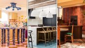
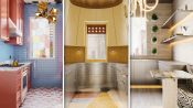
3 Interior Designers Transform The Same Kitchen
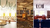
3 Interior Designers Transform The Same Soho Loft
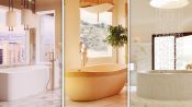
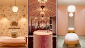
3 Interior Designers Transform The Same Luxury Bathroom
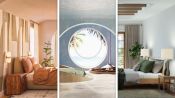
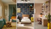
3 Interior Designers Transform The Same Bedroom
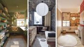
3 Interior Designers Transform The Same Home Office Space
3 Interior Designers Transform The Same Dining Room
3 Interior Designers Transform The Same Foyer
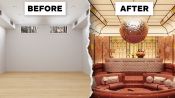
3 Interior Designers Transform The Same Cozy Living Room
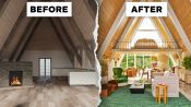
3 Interior Designers Transform The Same A-Frame Cabin
3 Interior Designers Transform The Same Walk-In Closet
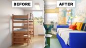
3 Interior Designers Transform The Same Kid’s Bedroom
3 Interior Designers Transform The Same Galley Kitchen

3 Interior Designers Transform The Same Backyard
3 Interior Designers Transform The Same Basement Rec Room
3 Interior Designers Makeover The Same College Dorm Room