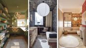
- Space Savers
- Season 1
- Episode 13
3 Interior Designers Transform The Same Galley Kitchen
Released on 06/06/2023
[Narrator] These three interior designers have been given
a photograph of an empty galley kitchen.
They have free reign to design it in any way they please.
My name is Courtney McLeod and my design style is elegant
but with a wink and a smile.
I'm Sasha Bikoff and my design style would be
if Maria Antoinette was at Studio 54.
My name is Becky Carter
and my designs are fearless, architectural and pallet savvy.
[Narrator] No clients, no restrictions, just blank space.
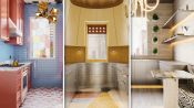
This is definitely a typical city kitchen.
It's small, it's sad.
What I don't love is
that this window just, it's not getting celebrated.
We are really limited on space.
We're really gonna have to rework this floor plan
in order to make things all fit.
[upbeat music]
I think in a kitchen,
one of the coolest things that you can do,
especially in a small kitchen,
is to do tile, but tile everywhere.
I'm selecting a really beautiful rich sky blue
for my wall tile.
And this one in particular is a fabulous hand glazed tile
by Fire Clay Tile.
And it really just made me think of nature and the outdoors.
I've decided to go with a small scale, one by one mosaic.
I think that this kitchen wants to kind of feel both retro
and futuristic at the same time.
And so I'd like the yellow
because it is a bit of a retro color.
I think I wanna keep this kitchen really light and bright
because it's a small galley kitchen.
I'm going to cover our walls in a travertine.
It's a natural stone.
It's going to add this like sense of luxury into the space
On our doorway, separating the adjacent space
to the kitchen,
I've decided to make this wall a little bit of a wing here
and I'm going to be adding a marquetery,
sort of a parquet up the side of this wall.
parquet and marquetery is something that's commonly seen
in more historical buildings and I just think it
would be really fun in my sort of futurist kitchen.
[upbeat music]
For this ceiling,
I'm gonna do this stainless steel ceiling
'cause I want it to be reflective
and I really like how the travertine
and stainless steel kind of go together.
It's really important that I keep this kitchen light
so that you can see when you cook.
On the ceiling,
I'm gonna be cladding the whole thing with a walnut.
The kitchen is inherently gonna be a space
with a lot of hard surfaces,
and I would like to bring in some warmth
and some natural wood by putting wood on the ceiling.
So the ceiling, everyone forgets the fifth wall
but I love, love, love to put interest on a ceiling.
And so in this space I'm planning to introduce
a wonderful pattern from a company called
Porter Teleo and they do these amazing
hand painted wallpapers on Japanese tea paper.
[upbeat music]
So in this kitchen we have what looks like an oak floor.
It's not a very remarkable material.
I wanna go with something
that's just a little bit more flashy.
The flooring that we are gonna be working with here
is very heavily inspired
by a designer named Gio Ponti.
And what I'm doing is I'm creating a geometric field
of different colors and stones
using all these different kind of stone colors.
These could be marbles, granites, quartzites, you name it.
I'm gonna use the same travertine stone
that I'm using on the walls on the floor as well.
I want there to be a really nice transition
from the walls to the floors.
So I really want to incorporate additional pattern
into the space.
And so for me, the ceiling
and the floor are going to echo each other.
My best piece of advice when you're trying to live
on the edge with pattern is to remember scale.
So if you're working with two bold patterns,
you wanna have one that's more loose, larger, more abstract
and then you wanna pair that with a pattern
that is tighter, more regimented,
but in the same or a complimentary pallet.
[bright music]
So the window has this very heavy black frame.
The window frame that I would like to do is stone.
We're going to be using one
of the stones from the floor, which will be this yellow.
I'm also changing the design of the framing.
So instead of having this more traditional kind of
four panel window system, I am switching it out
to design that feels a little bit more
like something you would see
in a more kind of European modernist department.
I designed a custom roller shade that is made
with brown leather and perforated with holes
so that you get these little peekaboos
of the scene behind the window.
I am going to take off the window frame
and I think I'm going to just create
a more simple window frame around this window.
So for the window,
I wanted to do something that will be a bit
of a literal translation
of a piece from the artist Tomás Saraceno.
His piece is a three-dimensional object,
and so I thought it would be really cool
to flatten that design and to turn it
into a stained glass window.
[upbeat music]
So the first thing I wanna do is move the sink
underneath the window.
And the idea behind this is
that you can wash your dishes, you can clean your fruit
and you can really enjoy this view.
Now for me, in a small kitchen like this,
the best real estate is right next to the window.
So I really don't want to ruin that area
with just a really big blocky piece.
And so I want to actually flip that
and move that tall solid piece away from the window
so that I can open that up and instead use that
as a space that will be a work prep area.
When I got the heartbreaking news
from AD that I could not take down this wall,
I started to really lean into a true galley kitchen.
I started doing research
on luxury yachts, trailers, air streams, airplanes.
If you have to have a real galley,
let's look at some real galleries.
I'm going to be making my upper cabinets
so that they are designed to be angled
and the angle is going to be tighter
at the bottom and wider at the top.
Something that I love about this is
it kind of feels like Marvin the Martian.
It's giving this spaceship vibe.
I'm paneling the fridge and all of our cabinetry
in stainless steel and the way that this steel works
with the travertine, it's almost like a natural material.
With this kind of like reflective silvery finish
you're almost not gonna see any
of the appliances in my kitchen.
For the cabinets in my kitchen,
I am planning to use a quarterly pinky red.
I really thought that it would help to reinforce the nature
or natural vibe of the space and be a perfect compliment
to the sky blue of the wall tile.
I've incorporated a bit of shine through a lacquer finish
so that will definitely add
to making the space feel brighter.
What I really don't like, you would walk into the space
and the first thing you would see would kind of
be this like big refrigerator.
I always like to hide them, so what I'm gonna do
with the fridge is I'm gonna move it
to the left side of the space.
That way when you walk into the room,
you are not going to, you know, see the fridge first.
So on my upper cabinets, I'm going to be designing them
with these porthole windows that allow you
to see ever so slightly into the cabinets themselves.
I like it because it does harken back
to a little bit of a marine feel.
It might be something you would see
on a boat or you might see it in a vintage trailer.
I have incorporated very tall upper cabinets.
It's really to take advantage of all the ceiling height
to get as much storage as I possibly can.
I've also made sure to do a variety
of doors and drawers to really add a lot of functionality
and variety that is perfect for a small kitchen.
So for the Lowers,
what we're doing is we're doing a custom kitchen
from a kitchen company called Abimis.
They make these cabinets and they started out
in creating custom kitchens for yachts.
So this is going to be a beautiful brushed stainless.
It is restaurant grade
and Abimis designed them so that the burners
of the range are just set into the countertop.
The whole thing is this monolithic piece of steel.
It's incredibly architectural, it's incredibly simple,
but at the same time has this really bizarre,
fun warmth to it.
It has these brass poles that I think really warm it up
and add that kind of feeling of jewelry.
Because we moved around our kitchen appliances,
we have created way more counter space.
This is really great
because you can now use this space for prep
but you can also entertain more easily
and you can have a bunch
of dishes or devs kind of on this counter.
I think that the client for this kitchen,
they might be city people who moved out to the country
and this is their pieta tear.
So I thought to myself, why take up so much space
and energy using a full size fridge when there are
really excellent drawer fridge products out there?
One of the focal points for my kitchen will be
a beautiful suite of Bertazzoni appliances
and for this kitchen I'm using a white range
which you know is a little bit unusual,
but I think it's perfect for this light and airy space.
It also has all of these wonderful brass accents to it.
Brass is something that I want to bounce around the room
so it's a really like a piece of jewelry within the space,
a functional piece of jewelry, but of course function.
We need to have safety
and so I've incorporated a complimentary vent hood
that is a perfect match.
I'm a big collector of tabletop.
I love glassware, I love vases and urns.
So I think the best part
of a kitchen is definitely having some open shelving
and this adds personality to your home.
I think that not only is it beautiful
to display your objects but it's so handy.
It's like grab and go.
You don't have to open up a door to get to what you need.
I am moving the sink towards the opening of the kitchen.
I'm sliding it down that wall right there
and I'm doing it purely to make room for the curve.
So by putting the sink there,
that's given us some more architecture to
be able to create that curved countertop in the back.
I really wanted to create kind of this Eden kitchen
and I love a breakfast duck.
The baked cat is upholstered
and I'm gonna do this Clarence house fabric.
I really like this fabric because it's neutral
but it has a really fun kind of wavy print to it.
The table I'm going to use in this space is vintage.
It's from the 700s and it's also made of travertine
and it has a steel element to it on the tabletop
so it really matches perfectly with our kitchen.
[upbeat music]
You don't expect to see a fabulous chandelier in a kitchen
but I think you should.
So here I want to lean
into that nature vibe and I'm pulling a fixture
from Rosie Lee, my favorite lighting designer.
I'm using her Laurel Blossom fixture,
which is like this but in more of a brass finish.
The chandelier is Matthew Lenore and it is
from Carpenter's workshop and I really was attracted
to this because it's like these tubes of light.
It's super modern, it's fun, and almost
like these tubes of light work really well
with the Clarence House fabric,
makes almost like this similar pattern in a way.
The light over the sink is a vintage light
from an Italian designer named Vico Magistretti.
It is a soft frosted glass dome
with a globe inside of it
and that's just gonna give a really soft diffuse light
throughout the entire space.
I love to incorporate all different types
of lighting into a space.
So we have our overhead light with our chandelier
but then we also have our counter lighting
with our LED strips and that's going to like
really give us this beautiful glow in the space.
The last bit of lighting was the chrome picture light.
Again, like very modern, very simple.
Instead of going with a typical linear under cabinet light
what I've decided to do is pepper the backsplash
with marine step lights.
What you're seeing here is really cool.
It's a little steplight that normally would be
mounted maybe two feet above the floor,
maybe a foot along a pathway
or up and down steps to help light your path.
These ones specifically are designed to go on a boat.
[upbeat music]
The piece of artwork that I chose is an iconic black
and white image of Bianca Jagger
coming into Studio 54 on a white horse.
I wanted something that was kind of
like iconic New York that went with the view
and went with our steel and our metal and our traveler team
and also this like wavy kind of groovy fabric.
I like to hang art in my kitchens.
This is a painting of the ocean and it's sort of feels
like a little window looking out to the sea.
I like that it's a sort of tongue in cheek nod
at our fantasy ship that we've created here.
My favorite element of this room is my little herb garden
which is these wall planters that I found that
have this kind of like futuristic space age feel to them.
They're made of fiberglass and they go directly
onto the wall and in them is basil
and rosemary and parsley, bringing nature into the space.
I have styled the countertop
with an almond bell freed tea set.
They have a very bauhausian quality to them.
They're super geometric and they feel very simplified
but also a little bit out of this world.
[upbeat music]
I really love my kitchen.
It feels personal and that's what I always try to do
in my designs, to think of someone who is not
afraid to express themselves in their home.
Well I think a lot of people kind of like steer away
from stainless steel kitchens 'cause they maybe feel
like it's too industrial.
But I think this is a great example
of how chic and cool they could look.
This is somebody who may not be cooking elaborate meals
but when they have cereal or they get their Chinese takeout
they're doing it with style.
[upbeat music]
Ooh
Wow. Wow. That like fascinating
Is amazing.
You and I went for that stainless steel kit.
I love it.
Okay, I've gotta know what was the inspiration
for the seating?
This is a Clarence house fabric.
I wanted like this really clean metal kitchen
with the travertine, so I was kind of just trying to think
about what fabric would funk it up a little bit
but stay in this like kind of neutral base.
I love a wave, so it kind of like brought everything
to that, like disco fun, like the 70s.
Yeah, it's such a great balance with like
the stark architecture of the kitchen
that you kept everything so clean and linear
and then the fabric just like flies in the face of that.
But in this way that just like perfectly dials in.
My favorite detail is my little herb garden there.
This is for a cook,
so if you need some fresh basilico you can just
you know, chop it off your wall over here.
[both laughing]
This is such a vibe, right?
It's a whole vibe.
My thought was if I have to go galley kitchen
I'm going like real galley kitchen.
So I started looking at the kitchens on yachts, on airplanes
in trailers and so there's a bit of inspiration coming
from like vintage air streams and that kind of feel.
That's where you're seeing some
of these port holes in the stainless steel.
And then I was also trying to harken
in a little bit of like a Milano 60s Milan vibe.
And I love the blue tile juxtaposed with that kind
of like rose blush, colored lacquer cabinetry.
You know, I was kind of thinking
like this is a typical small,
a little cramped and dark New York City kitchen
and so I wanted to really bring in something light and airy.
Then I brought in a little bit more of a literal
with a rosy lee chandelier, which I'm like obsessed with.
Is that, is that stain glass on the window?
Yeah, oh, you know
I just realized I'm kind of matching my-
Oh, you are.
I always say, always match your interior.
[upbeat music]

3 Interior Designers Put Their Spin on the Same Luxury Loft

3 Interior Designers Transform The Same Kitchen

3 Interior Designers Transform The Same Soho Loft

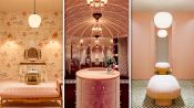
3 Interior Designers Transform The Same Luxury Bathroom

3 Interior Designers Transform The Same Bedroom
3 Interior Designers Transform The Same Home Office Space
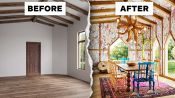
3 Interior Designers Transform The Same Dining Room
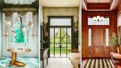
3 Interior Designers Transform The Same Foyer
3 Interior Designers Transform The Same Cozy Living Room

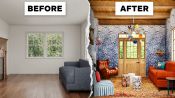
3 Interior Designers Transform The Same A-Frame Cabin
3 Interior Designers Transform The Same Walk-In Closet

3 Interior Designers Transform The Same Kid’s Bedroom
3 Interior Designers Transform The Same Galley Kitchen

3 Interior Designers Transform The Same Backyard
3 Interior Designers Transform The Same Basement Rec Room

3 Interior Designers Makeover The Same College Dorm Room