- The Blueprint Show
- Season 1
- Episode 20
Architect Breaks Down Why All American Diners Look Like That
Released on 06/01/2023
Everyone knows what a classic American diner looks like,
which is so recognizable that it's been exported
around the world as a symbol of American culture.
But why do they look that way?
Hi, I'm Michael Wyetzner
and I've been an architect for over 35 years.
Today we're breaking down
how architecture and design elements
from three different eras of US history
work together to give the classic American diner
that nostalgic glow.
So let's take a look at a typical American diner.
So the outside has a shape that's reminiscent of a train.
In fact, that's how diners got their name.
They're named after the dining car on a train.
Many of the design elements in a diner
are based on the necessities of dining on a train
in a railroad car,
like booth seating and counter seating,
and an open kitchen.
So I like these two photos because they show
all the elements that go into the classic American diner.
On the exterior,
you have that stainless steel smooth curvature,
you've got that Art Deco typography.
And then on the interior you have the checkered floor,
you have the booths, you have the globes,
and you have the jukebox.
In the early part of the 20th century,
trains were the dominant form of travel.
If you look at some of the earliest diners,
they were in fact, actual train cars
that were placed permanently on the ground.
Let's take a look at one now.
I love this photo.
This is a classic American diner
that takes place in an actual dining car
that was just taken off the tracks
and put on the ground and made into a building.
You could see that it's actually a train car,
with the upper windows there for ventilation
and the main windows here for viewing.
And you could see how narrow it is,
which necessitated a certain kind of design.
There's a counter, one row of booths and an open kitchen.
And that became some of the classic identifiable features
of the American diner.
So train travel peaked in the 1920s.
Fewer than 10% of Americans drove a car.
But by 1950 that had tripled.
And unlike with trains,
people in cars could stop anytime they wanted.
So diners, cafes, motels, and other types of buildings
that relied on people coming through their doors,
started to adapt their designs
to people driving in cars going 40 miles an hour.
They wanted to be eye-catching.
And one of the most important examples of this
is Googie's in Los Angeles.
So here's a picture of Googie's,
which is actually designed by John Lautner,
who is somewhat of a famous American modernist architect
who did the famous Chemosphere house,
which looks like a flying saucer
that landed in the Hollywood hills.
But the thing I love about this photo in particular,
is there's a whole style of architecture,
which is named after this diner called Googie's.
Googie architecture was very optimistic, very exuberant.
It was about abstraction and signage and brightness.
What I really like about this diner
is it looks like it could have been designed
in the late 1980s
as a deconstructivist piece of architecture.
With these planes that are connected by glass
that almost look like they're falling down.
So Googie architecture was coined by the critic,
Douglas Haskell, who was referring to this diner.
It's about loud signs and attention-getting buildings,
new sorts of forms.
It takes sort of mid-century modern architecture
and takes it to a different, less serious place.
And it's about a sort of optimism towards the future.
Started in the 1950s that was very influenced
by space-age sort of technology.
Even though it takes its name from this building,
this is actually not a prime example of it.
It actually morphs into something else.
And other designs took the idea
of appealing to motorists even further.
Designing buildings in such a way
that motorists didn't even have to leave their car.
Let's look at some examples.
Okay, this is such a cool photograph
because basically what it is,
a very simple square building in the middle
and then it's surrounded by this circular form.
And from this building there are little conveyor belts
that bring the food out to the cars.
I just think that's brilliant.
The building's actually designed as a hub and spokes,
which is actually sort of like a wheel,
unintentional or not.
And so the signage says, It's better food,
but not only that, it says, No tipping.
And that's not an instruction,
that's actually a benefit that they're advertising.
Hey, no waiters, no waitresses, no tipping.
Let's take a look at another example.
So working on that hub and spoke idea
is this sort of circular building,
which is very Googie in that it's starting to look
a little like a flying saucer
or something a little space-age.
And what's great about this one is,
the cars pull right up,
but they actually get served by actual people in this one.
But it's still a circular building,
which is sort of the most efficient way
to maximize the amount of cars
that can pull up to the front of your building.
So basically,
the building sits in the middle of a parking lot
so that cars could come from any direction
and pull up and get served.
And talk about eye-catching.
Look at all that neon. Can't miss Simons.
So the popularity of cars continued to increase,
and with it, so did Googie-style architecture,
which was meant to appeal to the car.
And that sort of culminated in Las Vegas.
So let's take a look at the iconic Las Vegas sign.
So no one driving into Las Vegas can miss this sign.
And I love this sign. There's so much going on.
All it says is, Welcome to fabulous Las Vegas, Nevada.
But within that there's like,
four different types of typography.
There's a starburst at the top.
There's this amorphous chevron shape
that forms the backdrop.
The letters are in these circles for Welcome,
which one might read as the planets.
There's the scripted Fabulous,
the bright red block letter Las Vegas.
And then the smaller Nevada.
And it all stands and is supported on this blue armature.
Nothing says Googie to me, like this sign.
So a lot of these flourishes in Googie architecture
are really very cartoony,
and it almost goes hand in hand with the rise of television
at the same time as the rise of the automobile.
And these sort of very simple shapes
and these very two-dimensional cartoony ideas,
are part of that.
So this is probably the most iconic
of those sorts of signs that are representative of Googie.
But if you drive anywhere in America,
especially in the '50s and '60s,
there were tons of other signs
for bowling alleys and motels and diners and cafes.
And they're ubiquitous throughout the country,
especially along the highways.
As the excitement of car travel reached its zenith,
people were already imagining what would come next.
In 1955, for the first time,
more people traveled by airplane than they did by train.
That same year in 1955,
the Space Race officially kicked off.
So when Russia launched the Sputnik satellite in 1957,
the Space Race kicked into high gear,
culminating with the US landing a man on the moon in 1969.
So we went from eating in a train to eating in a car,
and now let's start eating in a spaceship.
The Theme Building at LAX.
This is such a cool building.
Essentially, it's a flying saucer
hovering in the air where you can eat,
and it's supported by these two main arches,
which are actually steel covered in stucco,
although they appear to be concrete.
And there's a central tower that brings you up
into this sort of disc.
And within that disc is the restaurant.
And what's so cool about this restaurant
is it gives you views in every direction.
So this building also represents the evolution
of sort of Googie architecture.
So it takes eye-catching to a whole other level.
So where the round form before
was based on maximizing the amount of cars
you could bring around a building,
here they're staying with that round form,
but they're lifting it up in the air
to make it reminiscent of this sort of flying saucer,
which is very much in keeping
with Googie-style architecture.
So if this building was sort of hovering,
the next building we're gonna look at, really takes off.
And that's the Space Needle in Seattle.
So this is sort of the tallest example that there is
of Googie architecture.
It continues with that sort of cartoon theme
of this flying saucer sort of taking off.
And it's very reminiscent of The Jetsons
and what they would do in that famous cartoon.
But I like that it's got this huge armature
with these sort of curvilinear shapes.
And it's got one disc sort of low to the ground,
and this other set of discs really high
where people eat and get a whole view of the city.
And it sort of represents springing into the air,
this whole idea of space travel
where the impossible becomes possible.
This is what the future could be.
Let's build it now.
So although it appears to be very optimistic
and very forward thinking,
for me, there was always sort of a level of dystopia
involved in these buildings hovering so high,
as if the earth had been destroyed
and the only place to go was up.
In 1964, the world came to Flushing Meadow
in Queens in New York City,
and I think it was the highest point
that this style of architecture would reach.
And you could see, again,
this sort of idea of the hovering spaceship,
this mechanized architecture where it sort of plugs in.
And you could see the towers that hover above,
like we saw that were just reminiscent
of the Space Needle and the Theme Building.
This was the last time this sort of architecture,
which was so forward and so exuberant,
it sort of ended here.
So the 1964 World's Fair was all about technology
and the optimism of the future and what could be,
and then it all came crashing down.
That sense of the optimism for the future
and the patriotism ubiquitous in the Space Race,
came back to earth with the rise of the Vietnam War
and the fight for civil rights and the assassinations.
And all of a sudden,
the only parts of Googie architecture that sort of remained,
were the diners and the eateries that had started it.
And the Googie style, once a vision of the future,
became a thing of the past.
So today, when we see a retro diner,
and we think of it as a specific time in the 1950s,
it's really an amalgam of architecture from the 1920s
based on the train,
the 1950s based on the car,
the 1960s based on space travel.
And it's sort of this mashup altogether of all those eras.
So to eat in a diner is to experience an expression
of some of the best parts of our shared history,
our optimism for the future.
But in reality, it skips over many of the low lights
that were also present,
such as the Great Depression, World War II,
segregation and the Vietnam War.
What I love about diners is that familiar menu.
They all serve the same stuff.
Breakfast and hamburgers.
I mean, that's basically it.
Throughout the entire country.
And there's something so comforting
that you could go to a diner anywhere across the US
and know what's gonna be on the menu.
What do you order?
Let me know where your favorite diner is
in the comments below.
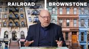
Architect Breaks Down 5 Typical New York Apartments
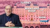
Architect Breaks Down Details of “The Grand Budapest Hotel"

Architect Breaks Down “Bridgerton” Mansions

Architect Breaks Down 6 Luxury Apartments from Billions, Gossip Girl & More

Hidden Design Details in Mad Men, That ’70s Show & More

Architectural Expert Breaks Down Disney Castle Details

Architect Breaks Down Baseball Stadium Details (Past & Present)
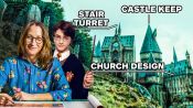
Expert Breaks Down Hogwarts Architectural Details

Architect Breaks Down the Evolution Of Batman’s Wayne Manor
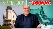
Architect Breaks Down 5 Haunted Houses From Scary Films

Expert Breaks Down Wakanda's Architecture In 'Black Panther'
Why The Chrysler Building is a New York City Icon

Architect Breaks Down NYC Subway Stations (Oldest & Newest)
Expert Compares Star Wars Locations To Their Real-Life Inspiration

Architect Breaks Down Movie Theater Evolution, From Palaces to Multiplexes
Architect Breaks Down 5 of the Most Common Skyscraper Styles In New York
Architect Breaks Down 3 Demolished New York Landmarks
Architect Breaks Down the Designs Of 5 Iconic Movie Bars

Architect Breaks Down 5 of the Most Common Houses in L.A.

Architect Breaks Down Why All American Diners Look Like That

Barbie Historian Breaks Down The Dreamhouse Evolution (1962-Now)

Why New York City Wouldn’t Exist Without These 5 Bridges