- Walking Tour
- Season 1
- Episode 6
Architect Explores San Francisco's Distinctive Styles
Released on 10/25/2022
I'm James Dixon.
I'm a practicing San Francisco architect,
and today we're going to take an architectural walking tour
of San Francisco.
[chill music]
The iconic building over my left shoulder
is the very famous Transamerica Pyramid,
completed in 1972,
designed by William Pereira and Associates.
You know you've arrived in San Francisco
when you see the Transamerica Pyramid.
One of the reasons, it's raison d'être for its shape,
which is you can see all the way through to downtown.
That was an important distinction
that the person who commissioned the building,
who was the CEO of Transamerica Corporation, said,
I want more light onto the street.
And the city said,
We want more vantage points to downtown.
So that shape reconciles those two desires
to a remarkable degree.
And you'll see at either side of the pyramid shape,
there are two concrete shafts.
One is the elevator core,
the other is the stairway shaft with the smoke shaft.
That's the reason for those.
But they work very well with the pyramid shape.
The building terminates the long axis of Columbus.
Columbus goes all the way from Fisherman's Wharf
through North Beach, the Italian area,
through Chinatown into the Financial District.
As an architectural quibble,
the way the building meets the sky
was given much more attention
than the way the building meets the street.
You'll see how they had
to resolve the inclined face of the building
with windows that don't wanna be inclined.
No one wants to feel like the building's falling on them.
So the way they resolved that
was with a series of concrete forms.
And the window frames are offset from one another
with the one above it,
so that when the building
horizontally meets the inclined edge,
that isn't ever a sliver, it's always a full window.
Both the Transamerica Pyramid
and the former B of A world headquarters building
are in the valleys.
So this is what led to the fear
of we're gonna have these tall things
at the bottom of valleys
that just creates this homogeneity of viewpoint.
Now we're standing in front of the Hallidie Building,
completed in 1917 by the architect of Willis Polk.
The building is named for Andrew Hallidie,
who was the inventor of the cable car system
here in San Francisco.
So he was a mining engineer
who was brought over from Scotland to say,
How do we get the ore out of the mines?
So he developed these
very Harry Potter esque carts on rails.
That same idea was then used for the cable car system
that is now a national registered historic landmark.
What you'll notice is that the facade is entirely glass.
There is a metal armature that supports the glass,
and then the metal armature goes back to be attached
to the structural skeleton.
This is seen as a radical departure
from what was going on in architecture at the time.
The idea of the glass cushion wall
is what's on display here.
What Polk is doing is allowing as much natural light
into the space as possible.
This idea of the glass curtain wall turns on its head
the famous architectural dictum window versus wall
and says window is wall.
In the same way that Frank Lloyd Wright said, No.
it's not the form follows function.
Form is function.
So the idea of that curtain of glass suspended
over a public sidewalk
on an armature you're just inventing, was so gutsy.
This had been done in Germany before by Walter Gropius.
But this is the, again,
the first or the second time in America this had been done.
But the idea of the madman era
when everything was a glass clad skyscraper,
is exactly the progeny of this idea.
Welcome to the incredibly beautiful Pacific Telephone
and Telegraph building.
This is the first modern skyscraper in San Francisco.
This was done in 1925.
So the way the building meets the street
is with an elbow-high level of Sierra Nevada granite,
and above that is terracotta.
This is a steel frame building.
I have to have it fireproofed.
So the way you do that, or the way they did it was
with terracotta around the steel skeleton.
And the terracotta does a very good job
of matching the original Sierra Nevada granite.
If you look at just above the entryway,
there is the beautiful Bell System bell.
And then even at each of the spandrel panels
at the lower floor,
there is a series of bells that hang down post World War I.
The idea of this new worldview,
this new architecture was a rejection
of any type of a European past.
Europe had nearly destroyed the entire world.
Pflueger loved the idea of the Mayan world
and the Chinese world
as the major influences of San Francisco architecture.
This building behind me is 555 California,
formally the world headquarters
of the Bank of America Building.
By using crystalline forms in each of the bays,
it achieves this geometric purity
going from the street to the sky.
And the geometric purity is maintained uninterrupted
until each of those individual bays end varying heights
on the facade.
Then there is a unified crown
that is very clearly faceted at each side
as it wraps and forms the top or the hat to the building.
And this building is one of the two that were seen
as the start of the Manhattanization of San Francisco.
As much as this building is loved, it also was feared
as making these canyons downtown like Manhattan.
So this talks a lot about the history of the era
and how we are housing modern corporate America
in these monuments to capitalism.
Now we're at the top of Telegraph Hill
at the base of the very famous Coit Tower.
This tower was completed in 1933
and was the result of a design competition.
It actually exceeded the height ordinance of the time,
but because it was so beautiful,
the board of supervisors, they also said, You know what?
We're gonna pass a new zoning law
so no one can build anything tall near this building.
From this vantage point, from the base of Coit Tower,
you can see the entire panorama of San Francisco.
The way this building meets the sky,
with this filigree of architectural bravado,
the building itself can be seen
as an abstracted fire nozzle.
The designer said that's not the case at all.
It is simply its own idea.
The building meets the ground with a beautiful colonnade
and a promenade around its entire base.
Housed within that base are controversial murals,
controversial when they were done
and controversial today.
It was done as part
of the Depression-era Works Progress Association.
There was a hammer and sickle in one of the murals,
and it was seen as so controversial,
at odds with American values,
that they padlocked the building
and had them paint over the hammer and sickle.
Then once it was painted over,
then they took the padlock off.
But still in those murals,
still seen are people in the murals reaching
for Das Kapital in the library,
browsing the workers' daily magazines
in the magazine racks.
It is a very stark social difference
between what was happening in the Depression era
with what was happening when the murals were done.
Behind me is the very famous Postcard Row.
These were all built in 1894 and 1895
by the Multi-Hyphenate Kavanaugh,
who was described as a carpenter,
designer, builder developer.
You pick the noun.
So all these are Queen Anne in style.
The defining characteristic of Queen Anne
is the roof form goes all the way through
from front to back.
You don't have the false fronts that you would have
in Italianate or in Stick style.
The roof form is telling the truth
about how the building was framed.
Previously, in the previous styles,
one was constrained by the balloon framing system
that went all the way from the foundation,
all the way up to the top of the roof.
Now with a new framing system called platform framing
or Western Framing, each floor was framed individually
so that each floor could do its own thing.
So every cubic inch of Queen Annes was usable.
I feel my Van Helsing duty and quest
to drive a stake through the myth of painted lady.
That was only a thing starting in the late sixties
right down here on Steiner Street.
No one wanted bright pink on the exterior of the building,
nor did they want that mixed with a lime green.
Guess who did?
Hippies were fine with that.
That was the cheapest possible paint,
and those were the cheapest buildings to rent.
And the hippie said, No, we're fine with low rents
and we're gonna paint them
the way our psychedelic dreams are.
[classy piano music]
Behind me is the gorgeous block
of 3,200 Pacific Avenue, known as The Wall.
The reason The Wall is so important,
it was the most prestigious address one could have.
The Wall is simply a masonry wall
that separates the historic Presidio
where the Spanish originally established their forts in 1776
from public land.
These houses on this block had the premier architects
of this era working at the height of their powers
with barely any limited budget.
But here is what was limiting.
These lots are ridiculously small.
The Wall comes at a trapezoid
to the rectilinear street grid
to the point that at the very bottom of this block,
the lot is only 14 feet wide,
then it comes to a point.
So that's a tough architectural challenge to meet.
They were up for the challenge.
The building immediately right here is 3232 Pacific,
done by the God Almighty, Ernest Coxhead in 1902.
This building is an example of First Bay area style,
if not the best example of First Bay area style,
which combines the informality of East Coast shingle style.
Shingle style was brought into being
by HH Richardson and architects of his,
again architects at the top of their game,
designing residences for the elite New York City socialites
who got tired of the fussiness and the formality
of living downtown New York City.
So they would design these homes based
on American colonial shingle architecture,
a rustic architecture.
These buildings carry through that informality
with a uniform wrapping of shingles on every surface,
including the roofs.
And this gets into the idea of skin buildings,
is once you have a skin,
anything that happens in it can be very irregular.
You can do irregular window sizes.
I can have a casement next to a double hung.
I can have a bay window next to an oriel window.
Who cares?
At the stairway above is a Palladian window.
Below that is a broken cornice over the front door.
Those elements are usually only found
in classical architecture, the broken cornice.
Down the block, great examples of Second Bay Area style.
What Second Bay Area style?
Second Bay Area style uses
the vernacular architecture of California.
So what Second Bay Area style does is say,
Everything is going to be horizontally based,
using simple materials, natural and exposed to view,
as large panes of glass as we can possibly manage,
and very simply constructed buildings.
So they were very carpenter-friendly.
Everything was a very carpenter-friendly right angle,
but very Californian in the sense
that I can walk right out onto the patio.
I can have an interior courtyard.
But everything is horizontally based
as if it were in some theoretical farm yard.
The difference to Third Bay Area style
is Third Bay Area style is vertical.
It's saying I am in San Francisco, I am in a city.
I have hard limits where my property lines are.
So Third Bay Area style, very vertical.
Second Bay Area style, very horizontal.
First Bay Area style, drop dead gorgeous.
This block going up, going down, going across,
every building is chock full
of excellent architects doing excellent work.
We're here to see two iconic things.
One is the San Francisco fog in summer.
The second is the very famous Golden Gate Bridge.
The Golden Gate Bridge was completed in 1937.
It was designed by two main engineers.
The chief engineer was Strauss,
and the principal engineer was Ellis.
Ellis has been given most of the credit
for the bridge's design.
Their architect who pulled everything together,
including the color, was Irving Morrow.
Irving Morrow kept a very art deco feel for this bridge,
going from the largest elements to the smallest,
the largest elements being these immensely tall steel towers
that have an inset and repeated parallel faceting
that works all the way up and goes to the sky,
and then is divided three times as it marches down.
The main thing about the bridge is this incredibly graceful
and beautiful 4,200-foot span.
The bridge meets the land with concrete abutments
to weight the lines down as they go into the earth.
The reason that's important is it is a suspension bridge,
and it wants to pull those suspension cables
right out of the land,
but they're anchored into the hillsides on both sides.
What Morrow does with the concrete abutments
is to give them the same faceting
that he used at the towers and elsewhere in the design.
Because art deco is an unabashedly vertical style,
it uses geometric ornament as its cornerstone
and as a linking device.
So the guardrails are a series of verticals.
The reason that's important is,
just like stroboscopic movies, just like zoetrope movies,
your eye quickly removes the vertical,
and you see what's behind it.
The Navy wanted the bridge painted in a striped pattern
because of danger to shipping.
And Morrow said, We're not doing that.
He said, We're using this color.
I'm gonna call it International Orange.
So the Golden Gate Bridge is not named
for the color International Orange.
It is named for the Golden Gate Strait that it bridges.
[chill music]
Architect Reveals Hidden Details of Washington, D.C.
Architect Reveals Hidden Details of Brooklyn

Architect Reveals Hidden Details of Georgetown
Architect Explores New York City's Greenwich Village
Architect Explores New York City's Upper East Side

Architect Explores San Francisco's Distinctive Styles

Architect Explores Chicago's Hidden Architecture & History

Rockefeller Center, Explored & Explained

Architect Explores Chicago's River North Neighborhood

Architect Explores Wall Street's Details & History

Architect Walks SoHo NYC, Exploring Its Distinctive Style

Architect Walks New Orleans, Exploring Its Distinctive Style
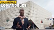
Architect Explores Downtown Los Angeles’s Diverse Architecture & History
Why The World’s Tallest Apartment Buildings Are On The Same Street

How Walt Disney Concert Hall Was Designed To Be Pitch Perfect

How The Upper West Side Revolutionized NYC Apartments